

Home & Decor Blogs: DIY, Interior Design & Lifestyle Ideas
What Sydney Painters Are Actually Being Asked For Right Now
Every trend article about interior paint says roughly the same thing. Warm neutrals are in, cool greys are out, sustainability matters, matte finishes look better. All of that is true. None of it explains why any of it is happening in Sydney specifically, or what a homeowner should actually do about it.
The shift isn’t really about colour. It’s about what people are asking their homes to do for them at the moment, and paint is the fastest and cheapest way to make a house feel different. Sydney’s residential painting scene has moved a fair distance in the last couple of years.
Why Cool Grey Walls Look Dead in Sydney Light
Picture the situation that happens hundreds of times a year across Sydney. A homeowner finishes settling into a unit built somewhere between 2015 and 2022. The walls are Dulux Tranquil Retreat or something in that same family of cool greys that dominated the developer palette for a decade. It looked perfect in the display suite. It looks perfect in every real estate photograph they’ve ever seen of the building.
Then they live in it for a month and the walls just look flat.
The colour hasn’t changed. The paint is fine. What’s happening is that Sydney’s natural light has a warm cast to it through most of the year. Cool grey has blue and slightly green in it. Warm light hits those tones and drags them somewhere weird. In the morning the walls read slightly blue. By late afternoon they look dead. The same colour painted in a Melbourne apartment sits perfectly on the wall because the ambient light down there runs cooler and the tones stop fighting.
Warm neutrals fix it because they’ve got yellow, red, or brown in them instead. Those tones pick up Sydney’s ambient light rather than losing to it. Dulux Blended Cream and Dulux Hog Bristle Quarter from the Elemental palette are two of the most requested whole house neutrals in Sydney residential work right now. The wall stops looking like a paint chip and starts looking like part of the room.
Andrea Lucena Orr, Dulux’s colour and communications manager, has framed the broader shift as a response to digital fatigue and cost of living pressure. She’s said pretty directly that in uncertain times people gravitate toward stability in design. That’s why the palettes leaning warm and comforting have taken off. Nobody’s asking for excitement on their walls anymore. They’re asking for calm.
There’s also a mundane practical reason warm neutrals win on repaint jobs. Cream over cool grey needs two coats plus a tinted undercoat, or the grey ghosts through. Skip the undercoat to save an hour and the finish never quite settles. That’s why the same “just do the walls” quote from a painter can come back at wildly different prices depending on what’s already on there.
Low VOC Paint Is No Longer a Nice To Have
Most articles mention low VOC options and treat it like a bonus feature. In Sydney residential work it’s closer to the default expectation now, especially in family homes and apartments where the painter’s leaving and the residents are moving back in the next day.
The chemicals in traditional paints off gas for weeks. Sometimes months. Anyone who’s slept in a freshly painted bedroom three nights after the painter left knows what that means for how the room actually feels.
Dulux Envir02 and Dulux Wash and Wear now come in low VOC versions that cover as well as the conventional ones. Porter’s Paints has been low VOC across the whole range for years and their limewash work is still what most designers specify for feature walls. Haymes Ultra Premium turns up on high end jobs where an interior designer is involved. Resene Zylone Sheen is the New Zealand one that some Sydney painters keep coming back to for allergy sensitive households, though nobody stocks it locally and it always has to be ordered in.
The catch nobody mentions: low VOC still smells. Not as bad, not for as long, but it’s not odourless. Ventilation still matters. What it does mean is that within 48 to 72 hours the room is genuinely liveable, which is not the case with older oil based products.
Cost wise the low VOC premium runs about 10 to 20 percent more per litre. On a three bedroom repaint that’s an extra $200 to $400 in paint. Against the labour cost of the whole job it’s a rounding error, and the calculation over the life of the paint on the wall isn’t really a calculation at all.
Matte Finishes and What Sydney Light Does to Them
The move away from gloss on interior walls isn’t purely aesthetic. It’s structural in Sydney because of what direct sun does to a shiny surface.
Think about the standard new apartment layout that’s been going up for the last decade. Big north facing living area with floor to ceiling glass. West facing bedrooms taking full afternoon sun. That’s a lot of direct light hitting the walls for a lot of the day.
Glossy and semi gloss finishes throw that light straight back into the room. Every scuff, every roller mark, every place where the wall was patched shows up in the reflection. The paint job itself is fine. The wall looks busy anyway because the sheen is doing all the work of exposing whatever’s underneath.
Matte and low sheen finishes absorb rather than reflect. Walls stop competing with the windows for attention. Colours read truer. Small imperfections disappear.
Durability used to be the problem. Traditional matte paints marked easily and burnished when you tried to wipe them down. That’s why kitchen and hallway work stayed on low sheen for so long. The newer premium matte lines have mostly fixed this. Dulux Wash and Wear Matt, Haymes Expression Ultra Premium Low Sheen, and Porter’s Paints Aquanamel in matte are all genuinely washable now.
Still doesn’t work in kitchens and bathrooms with real moisture and cleaning demand. Still doesn’t work if there are young kids or a big dog that shakes near the walls. In those situations low sheen or satin is still the honest answer.
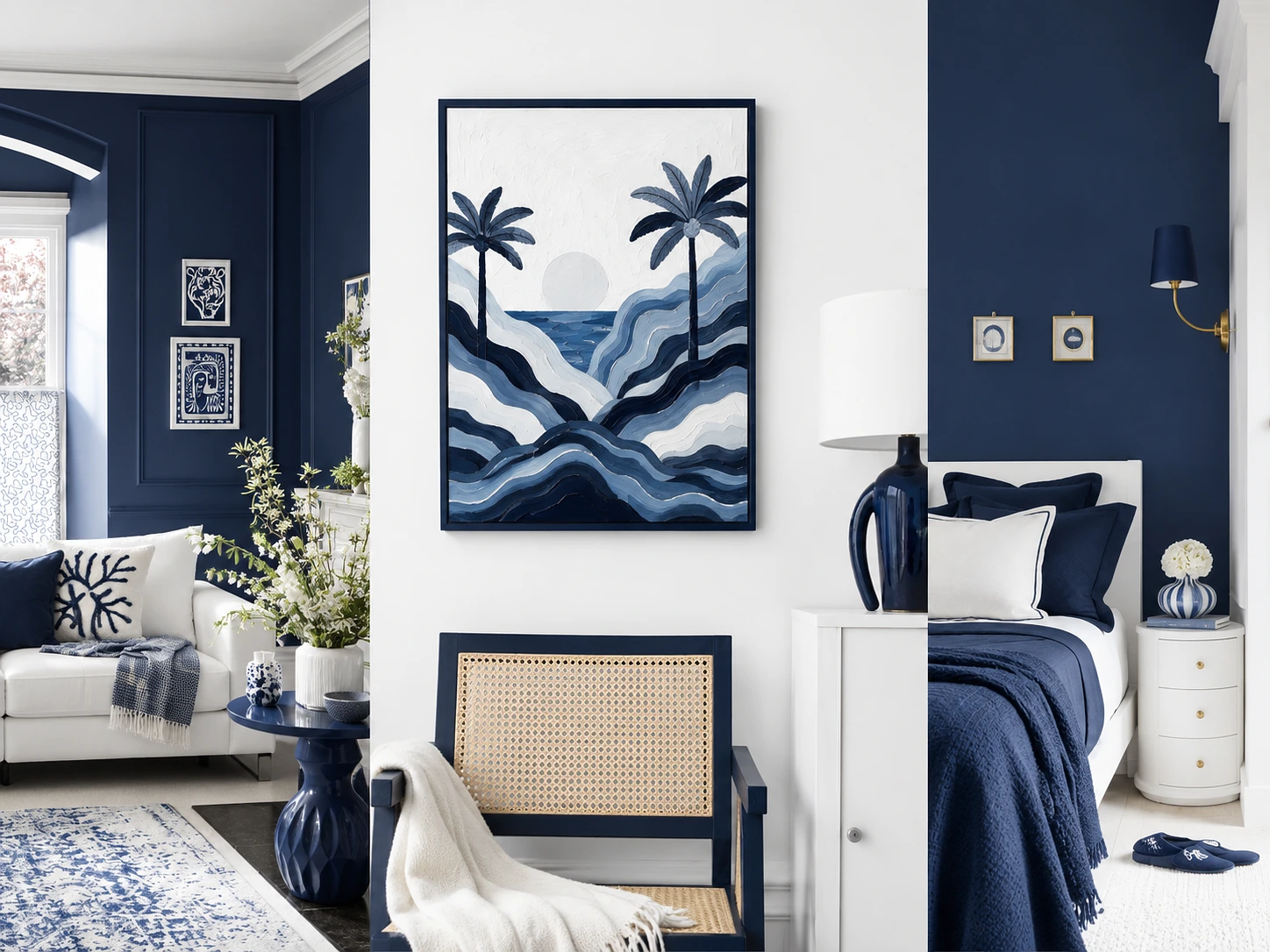
Feature Walls Getting Quieter
The bold feature wall from the mid 2010s is basically finished in Sydney residential work. Nobody’s asking for the accent wall in navy against three whites anymore. What they want now is more subtle, and it’s driving most of the specialty finish work that painters in Sydney are being called for.
The current version is often the same colour family as the surrounding walls but one or two shades deeper. Tonal shift rather than contrast. Or it’s limewash or suede finish in the same palette, adding texture but no real colour change. Micro cement and Venetian plaster turn up behind bedheads. Two tone walls with a horizontal break at picture rail height, done in adjacent shades from the same palette.
Limewash has become the specialty finish everyone in older Sydney housing seems to want. It’s uneven by nature, brush marks show, colour varies across the wall. On old plaster and brick in a terrace that suits the surface better than flat modern paint ever would. Porter’s Paints and Bauwerk are what get specified. Application costs more because it’s slower and takes real skill, but it reads as intentional character rather than a job someone couldn’t afford to finish properly.
The Instagram Colour That Gets Repainted Within a Month
The one that painters get called back for constantly is the Instagram driven colour choice. It always plays out the same way.
Homeowner sees a deep olive dining room on social media. Screenshots it. Orders sample pots. Paints the room over a weekend. Hates it by the next weekend. Calls a painter to fix it, and the room ends up repainted in something completely different inside a month.
The reason is that photographed interiors are curated, styled, professionally lit, and shot in properties chosen for their light. That olive was almost certainly in a room with generous natural light, timber flooring, and furniture that was chosen to work with it. The same colour on the same wall in a Sydney terrace with north facing living and a dark bedroom at the back will do completely different things in each room.
The deeper terracotta, olive, and rust tones from the Evoke palette work beautifully in the right room. The room matters more than the paint. Good natural light. Timber flooring or joinery to balance the depth. Enough dimensions in the space that the colour doesn’t close it in. Furniture that either sits in the same palette or contrasts on purpose.
A small dark bedroom in deep olive without any of that reads cave like rather than cocooning. That’s the specific callback. The fix is usually the same palette but two or three shades lighter, or the deep colour restricted to a single wall with the right support around it.
What A Full Repaint Actually Costs In Sydney
Most trend articles carefully avoid the numbers. Here they are.
Single room repaint, walls only, standard paint, somewhere between $500 and $1,200 depending on room size and prep. Full three bedroom apartment repaint including walls, ceilings, and trim, $3,500 to $7,500. Full three bedroom house interior, $6,000 to $15,000 depending on ceiling height, cornices, and whether there’s Federation detail to work around. Limewash or Venetian plaster runs $80 to $200 per square metre applied, plus material. Colour consultation with a paint specialist for an in home session, $150 to $500.
Prep work moves these numbers more than anything else. Modern apartment with square rooms, standard ceilings, previous paint in decent condition, the low end of every range. Federation terrace with picture rails, ornate cornices, and layers of previous paintwork that need proper preparation, the top of every range.
Three quotes for the same three bedroom terrace can commonly come back at $4,000, $8,000, and $12,000 with genuinely different scopes behind them. The cheap quote skips real prep, uses a mid tier paint, gives one coat where two coats are needed. The expensive quote includes proper substrate preparation, premium paint, two full coats over an appropriate undercoat, and detailed cutting in on all the trim.
Reading the quote is what matters. Not the trend article.
The paint on your walls quietly becomes one of the most emotionally influential design decisions in the house. Less than new flooring or a kitchen refit. Changes the feel of the space more than either of those. Sydney residential work has been moving warmer, softer, more considered about how light behaves in the specific room it’s going into, and less interested in mimicking anyone else’s Instagram. If the walls settle you the moment you walk in the door, the colour is doing its job.