

Home & Decor Blogs: DIY, Interior Design & Lifestyle Ideas
Five Cafe Interior Design Ideas for Winter, From Warm Minimalism to Curved Booths

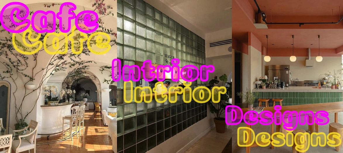
Winter has started, and we have begun to feel that cold breeze in the air. That cozy feeling at dawn is at its peak now, when you’d happily wait in line for ten minutes if the place at the end of it is warm and smells of toast, and most of us have one cafe like that we keep going back to. The coffee is part of the reason, but the room matters just as much, and five interior styles keep turning up in the cafes people choose to stay in this year.
1. Warm Minimalism Makes a Small Cafe Feel Bigger
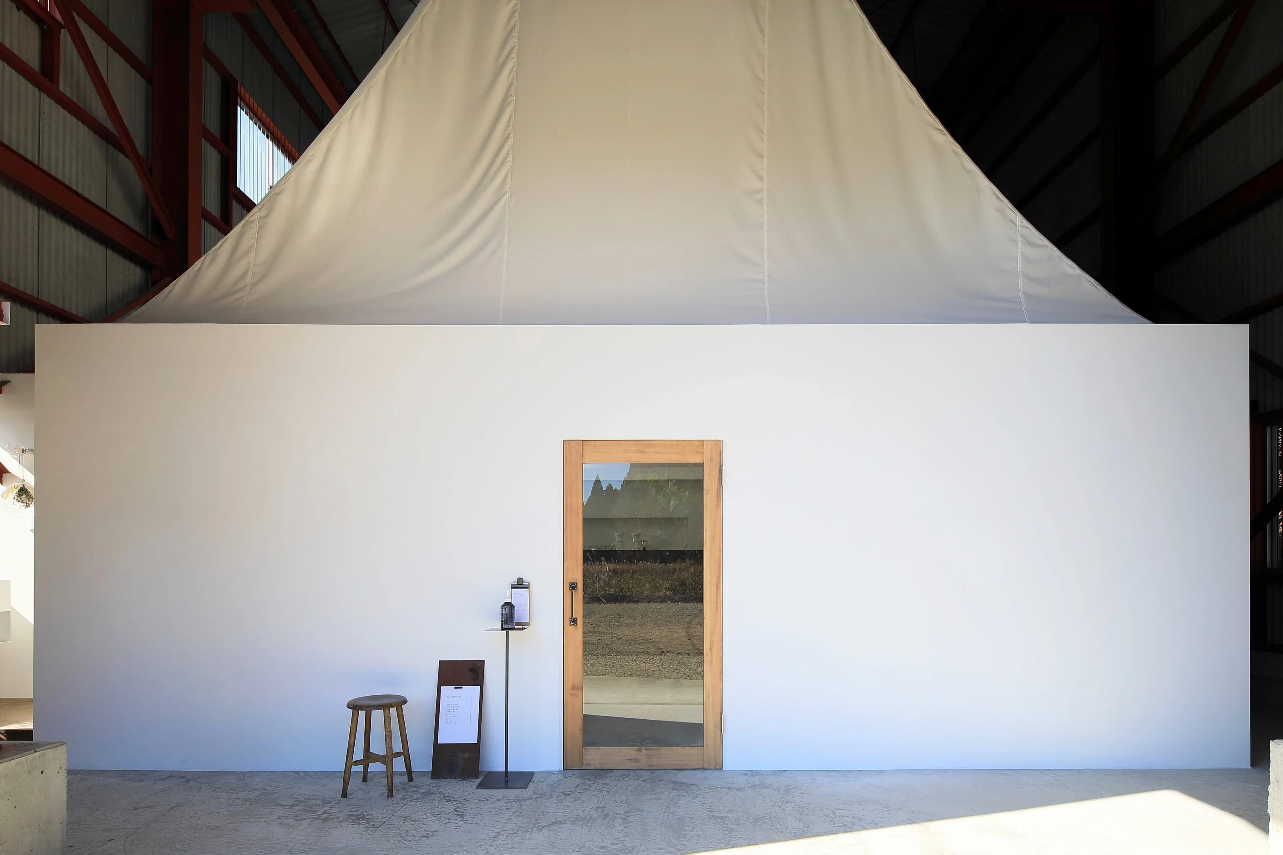
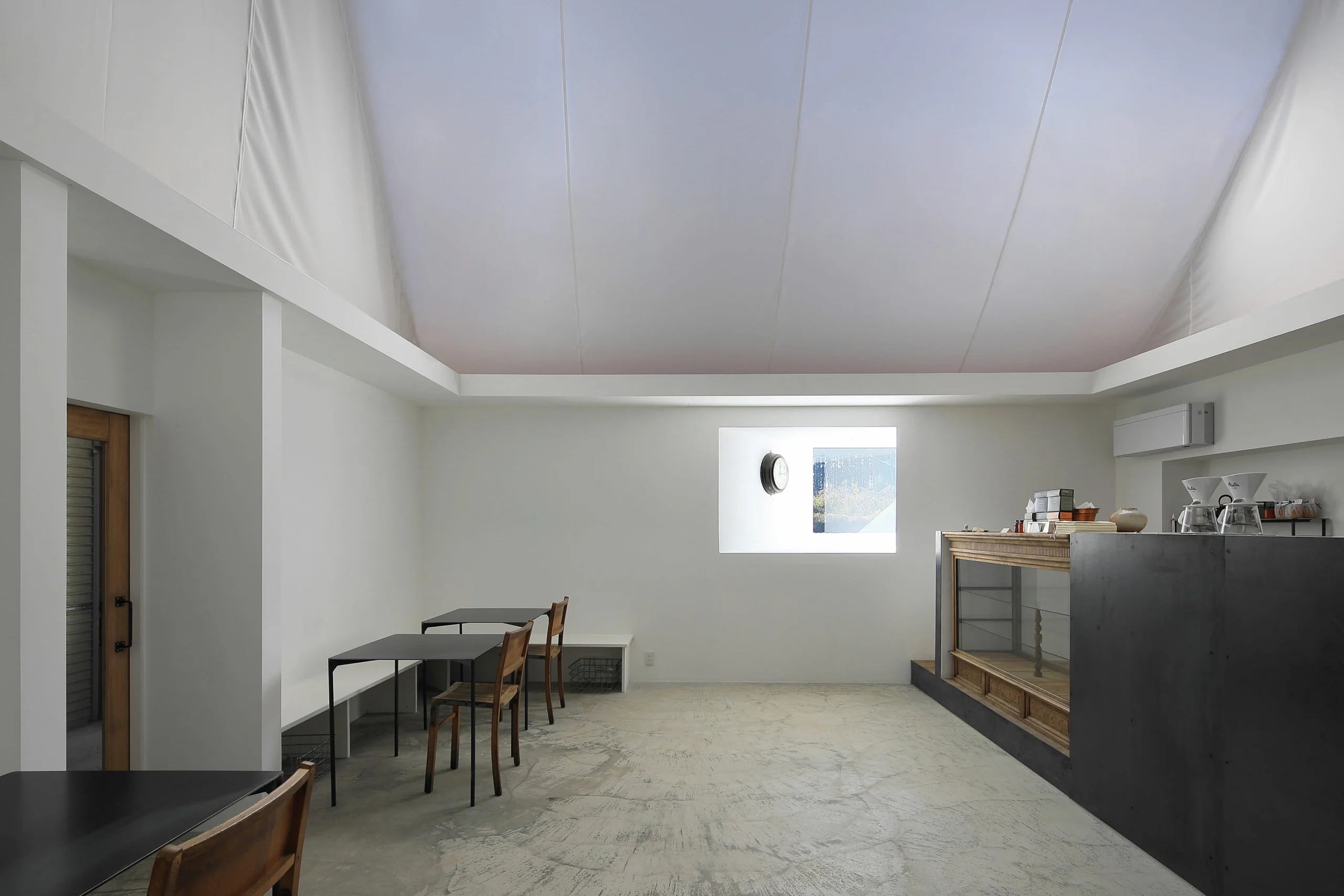
Warm minimalism keeps the clean lines and clear counters of plain minimalism but swaps the white and gray for light oak, limewashed plaster and soft neutrals, and that one change is what stops a small room from feeling like a showroom. Living Solutions Global, an interior fit out firm, describes it as keeping the discipline of minimalism while adding warmth, which is about as good a summary as you’ll find.
It suits a small specialty cafe better than anything else here, because a room with fewer things in it looks larger and takes less time to wipe down at night. Counters are where it falls apart. If the coffee machine, grinder, cups, card reader and tip jar all end up on show, the look is gone within a week, so it pays to have cupboards built under the counter before you open instead of hunting for space once you’re trading.
2. Industrial Chic Works Once You Soften the Concrete
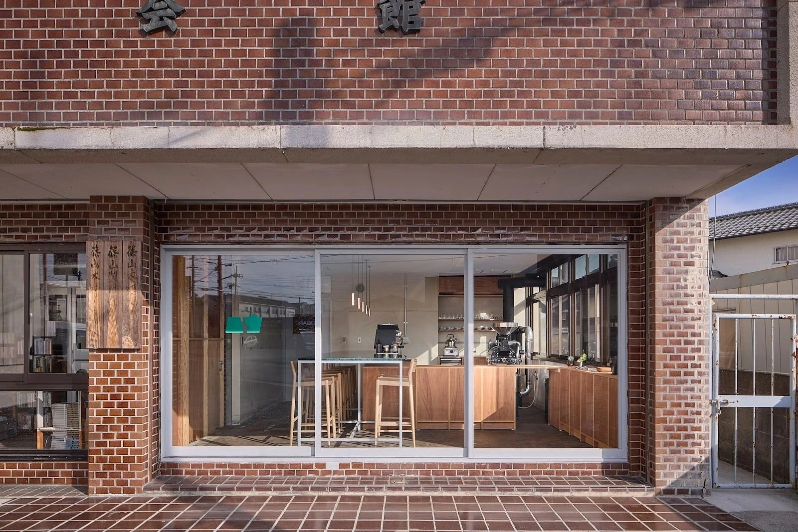
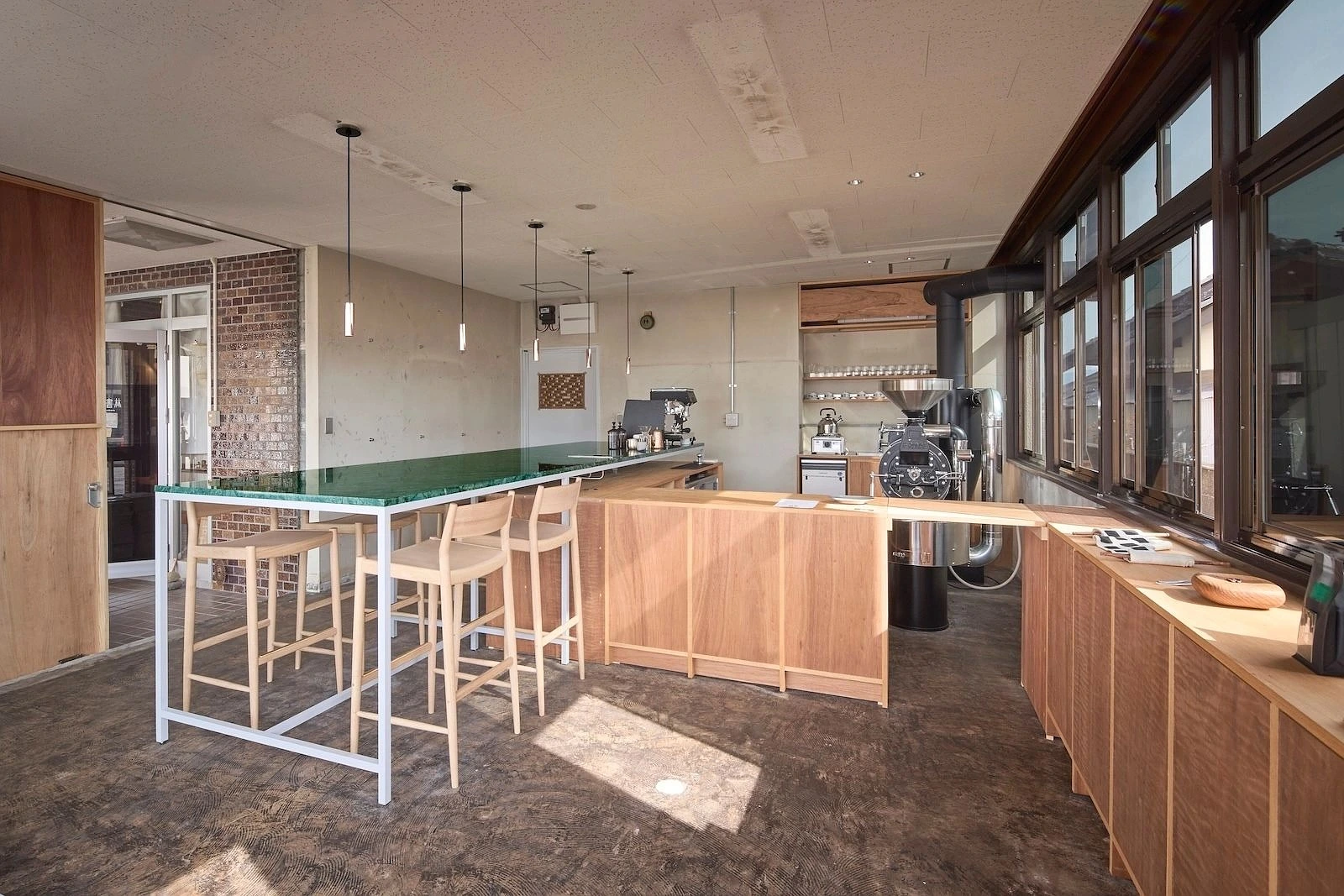
Exposed brick, polished concrete, black metal and an open ceiling with the ducts on show can still make a cafe look like it has a history, even in a building that went up last year. Eduardo Weisinger, who is the co-founder of Earthwize, providing commercial cleaning in Brunswick, suggested this idea to me, and from a cleaning point of view I can see why, since sealed concrete floors and metal frames are some of the easiest surfaces in a cafe to keep looking good.
The older version of this look could feel cold, though, and a room full of metal chairs on a concrete floor in January isn’t somewhere you’d want to sit for long. Today’s version mixes the raw materials with softer pieces:
- Timber tabletops go on the black metal bases, so you’re not resting your arms on cold steel.
- Upholstered banquettes along the brick walls give people a warm place to sit, and they soak up some of the noise that bounces off all those hard surfaces.
- Warm bulbs in simple enamel or cage pendants stop the ceiling from looking like a warehouse.
The noise point matters more than most owners expect. The Living Solutions team puts it bluntly, saying that guests rarely tell you a cafe is too loud and simply don’t come back.
3. Biophilic Design Gives People a Reason to Stay Longer
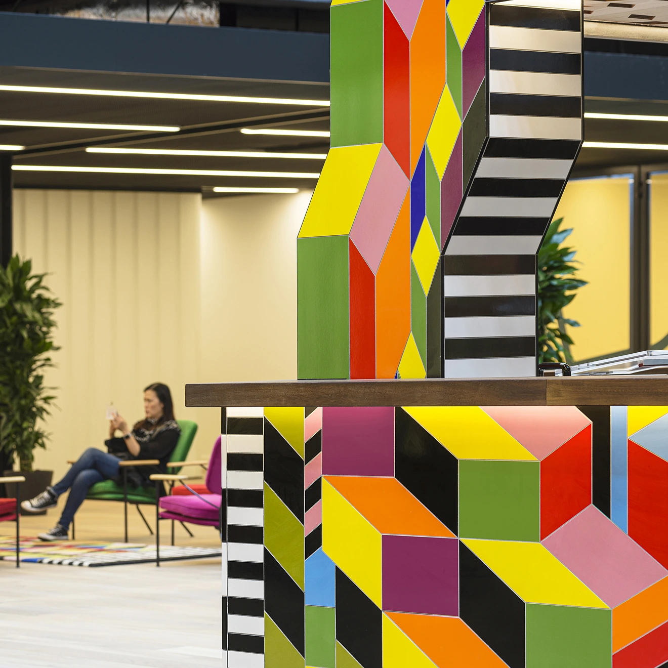
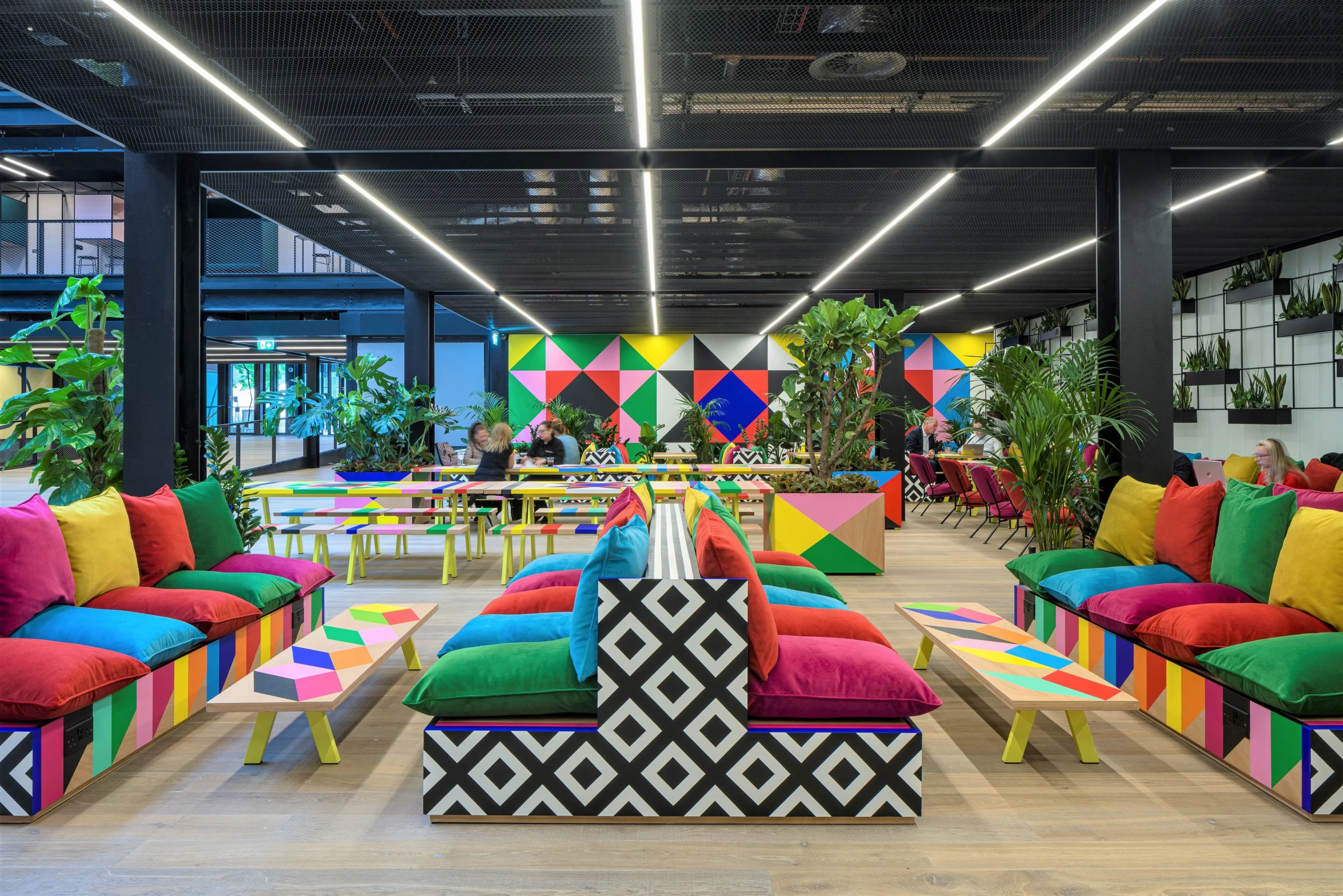
Biophilic design is the name architects give to bringing nature into a building through plants, daylight, timber and stone. Terrapin Bright Green’s 2014 report 14 Patterns of Biophilic Design describes how those elements can help reduce stress in the places people spend their days, which in a cafe could be the difference between someone leaving after one coffee and someone ordering a pastry as well.
You don’t need a living wall to get there. A few large plants that can handle a cold draft from the door, like a rubber plant or a snake plant, a trailing pothos on a high shelf and your best seats pushed up to the windows will give you most of the effect, and none of it needs a specialist to keep alive.
4. Japandi Suits Cafes That Want Calm Without Looking Flashy
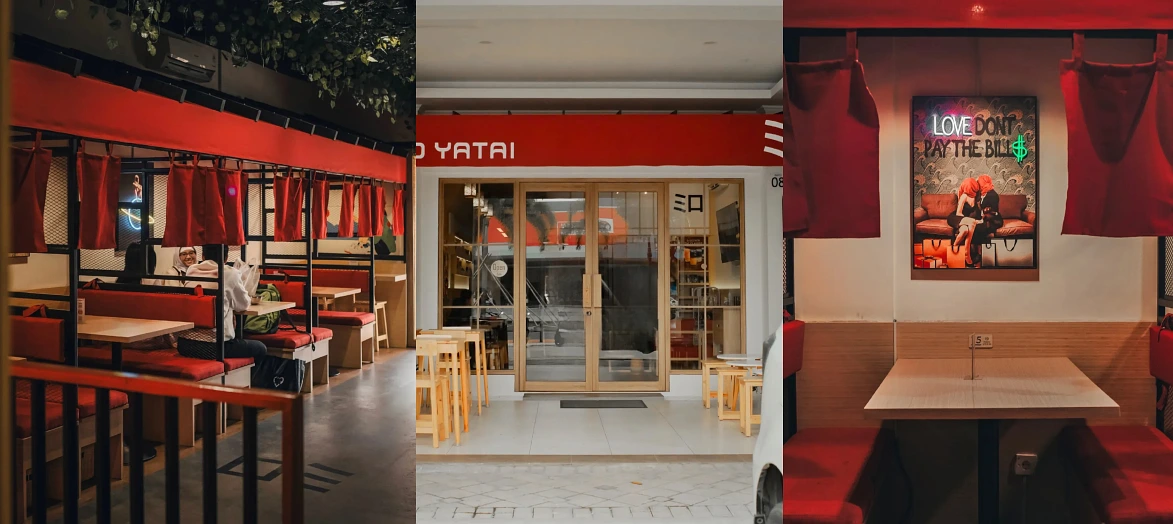
Japandi takes the simplicity of Japanese interiors and the warmth of Scandinavian ones, and in a cafe it tends to mean pale timber, beige and clay colors, chairs with rounded edges, linen textures and very little on the walls. It sits close to warm minimalism, but it leans further into handmade details, so a rough ceramic cup, a paper lantern or a low wooden bench matters more here than in any other style on this list.
I’d pick it for a quieter, slightly more premium cafe with a short menu and filter coffee, because it looks considered without tipping into luxury. If yours is a busy counter where most people order and leave by 8am, the sparse look can start to feel unfinished under that much traffic.
5. Curved Boutique Design Gets the Photos and Keeps the Comfort
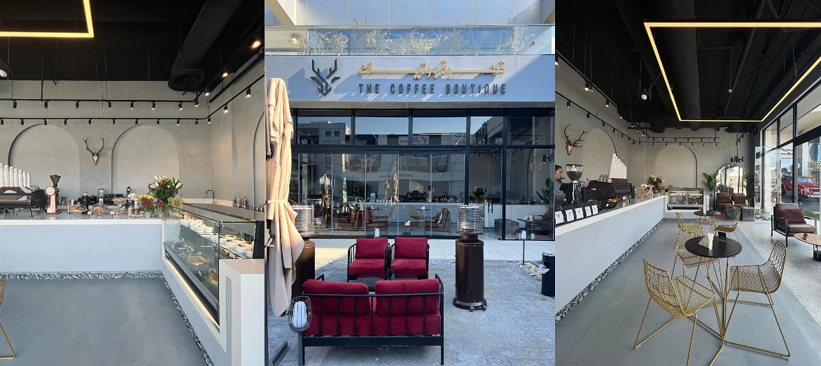
Curves have been replacing sharp corners in a lot of newer cafes, with rounded booths, curved counters, arched doorways, textured plaster and one statement light over the room. NG Interior Design, an interior studio in India, says rounded booths and tables with soft edges feel more inviting, improve the flow of people through the room and photograph well, and that last part counts if a lot of your new customers find you on Instagram.
Rounded table edges don’t catch anyone’s hip in a tight room either. Where this style goes wrong is when the curves are there for the photo and the seats themselves are hard and shallow, because people will take the picture and leave.
If you’re fitting out a cafe this winter and can only commit to one of these, I’d start with warm minimalism, since it works in almost any size of room and you can add plants or a curved booth to it later without starting again.
 Decor & Improvement Accessories