

Home & Decor Blogs: DIY, Interior Design & Lifestyle Ideas
7 Creative Ways to Use Terracotta Tiles in Modern Interiors
Grey had a good run. For better part of a decade, cool grays and crisp whites covered everyone’s bathrooms to living rooms. But that’s changing. Designers are now looking at 2026 as the year that earthy tones will prevail — sands, taupes, and yes, terracotta. “People are interested in homes that look lived-in, not like a showroom,” reflects Micaela Quinton of Copper Sky Design.
Terracotta makes a lot of sense, when you think about it. What you have is texture, natural variation in colour and a material that doesn’t pretend to be what it’s not. Each and every tile bears subtle evidence from the kiln — which may seem like an issue until you realize that’s literally what gives it character. And if you are afraid that the final result will be a kitchen straight out of a Tuscan vacation rental, don’t. And, of course, you can go subtler (in format or finish) if that’s more your speed.
Here’s how to use terracotta in your space without going overboard.
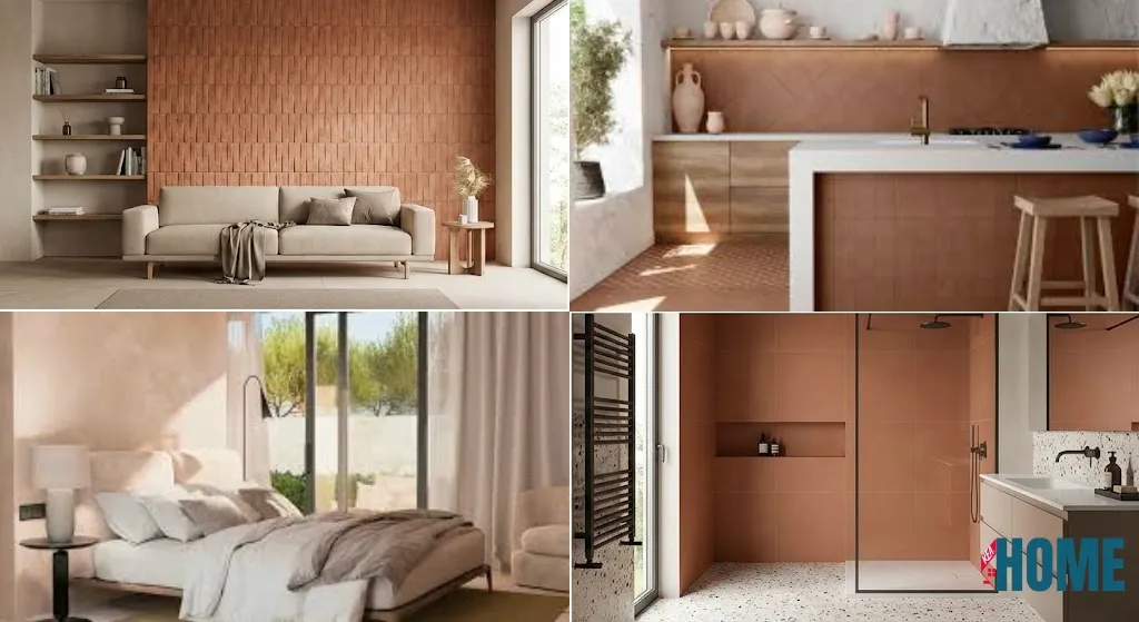
1. Feature Walls That Pull Their Weight
The feature wall behind your sofa or TV isn’t a new idea. But terracotta does something useful here — it adds depth without you needing to layer patterns or throw art at the problem.
Textured terracotta wall tiles catch light differently throughout the day. What looks warm and soft in the morning shifts to something moodier under evening lamps. The wall basically changes character on its own.
Keep everything else quiet. Light furniture, neutral floor, minimal clutter on shelves. If you’re going bold on one wall, the rest of the room needs to step back and let it work.
2. Kitchen Backsplashes (Without the Tuscan Chef Costume)
Kitchens aren’t just cooking spaces anymore — people hang out in them, work in them, eat breakfast standing at the counter. Terracotta fits this shift better than you’d expect, as long as you don’t go overboard.
A full terracotta kitchen is too much. A terracotta backsplash paired with matte cabinets and open wooden shelving? That works. The natural clay softens all those hard edges and sleek surfaces that modern kitchens tend to have.
Use beige tiles on floors or adjacent walls to stop the space feeling heavy. If you want movement, try a herringbone layout — it adds visual interest without making the room feel busy. Simple cabinets, let the tile do the work.
3. Bedroom Headboard Walls
Sounds strange, tiling behind your bed. But skip the paint or wallpaper for a moment and picture a terracotta accent wall instead. It creates this grounded, almost nest-like feel that’s hard to get any other way.
Go light here. Something like Spectra Salt from Simpolo Tiles & Bathware — it’s a pale, concrete-look terracotta with a matte finish. Doesn’t shout for attention, just sits there quietly making the room feel settled.
Neutral bedding. Skip the patterned throw pillows. Warm lighting. You’re going for rest, not a Pinterest board.
4. Bathrooms That Don’t Look Builder-Grade
Most bathrooms default to clinical whites and greys. Fine, but forgettable. Put terracotta on your shower walls or behind the vanity and suddenly the room has a point of view.
Abstain from shininess, partially for grip and partially because glossy terracotta looks contrived. Matte soaks up light, quiets shadows and ages without reflection.
Surround it with beige floor and wall tiles. Keeps things light, visually prevents the space from closing in. Think small boutique hotel not converted barn.
5. Defining Zones in Open-Plan Spaces
Open-plan living is a practical choice but also makes for an obvious headache: where does the dining area end, and the lounge begin? You don’t want walls, but you need some kind of separation.
Terracotta handles this nicely. Add terracotta wall tiles in the dining area, but keep the living space lighter. Your eye reads it as a separate zone without the necessity of a physical barrier.
Large-format tiles suit this best. Less grout means cleaner sightlines, and that counts when you’re aiming to keep things feeling open. The tile is the demarcation; the slimmest of grout lines prevent it from looking fussy.
6. Softening Industrial Interiors
I’m not sure that terra cotta and concrete should go together, but this time it does. Industrial spaces — that exposed metal, raw surfaces, hard textures — can feel cold or incomplete. They’re in want of anything natural to balance things.
Terracotta accomplishes this without killing the industrial edge. The juxtaposition enhances both materials: the terracotta comes off as more sophisticated against concrete, and the concrete looks upscale against something with a handmade feel.
Integrate terracotta wall tiles with beige tiles elsewhere to connect the palette. Lets the industrial materials take lead while adding some warmth where it’s welcomed.
7. Small Spaces and Statement Niches
Here’s the thing about small rooms — they’re actually easier to design. You can commit fully to one material without worrying about overwhelming the space.
Powder rooms, entryways, reading corners — these are perfect for terracotta. A single feature wall or tiled niche creates impact without needing extra décor. The natural colour variation and texture does the decorating for you.
Hexagonal layouts work particularly well in compact spaces. They add visual interest and can make narrow areas feel less cramped. Keep the surroundings neutral and let the material speak.
Layouts Worth Considering
Terracotta comes in more than just squares these days. Different formats create different effects:
Herringbone adds movement. The zigzag pattern draws the eye and actually makes narrow spaces feel less tight. Works well in kitchens and entryways.
Hexagon has that vintage, European feel. Geometric without being busy. The honeycomb pattern is a classic for a reason.
Large-format tiles (12×12 and bigger) mean fewer grout lines and a calmer overall look. Suits minimalist spaces where you want the material to show, not the grid.
Subway is the contemporary option. Elongated rectangles in staggered rows — less traditional than squares, especially on walls.
The Colour Spectrum
Terracotta isn’t one colour. The range runs wider than people expect:
Natural red clay is the classic. Unmistakably Mediterranean, sun-baked warmth.
Washed terracotta covers your peaches, blushes, and sands. Softer, quieter. Works in coastal and Scandinavian-leaning spaces.
Blackened terracotta goes dramatic. Pairs well with brass fixtures and oak furniture.
White terracotta is clay with a pale wash. Almost Nordic. Minimalist without feeling sterile.
Worth knowing: sealing affects colour. Matte sealers keep things raw-looking. Enhancing sealers deepen the tone. Gloss adds reflectivity — though honestly, matte usually looks better.
What to Pair It With
Terracotta’s warm, so you need to balance it:
Neutrals like off-white, sand, or cool grey stop the terracotta from taking over the room.
Natural textures reinforce the organic direction — wool rugs, rattan, linen, plants. It all hangs together.
Metal accents add contrast. Brass, copper, matte black hardware — pick one and stick with it.
Wood is the obvious partner. Wooden cabinetry, shelving, or flooring feels cohesive rather than forced.
Practical Bits
Terracotta develops a patina over time. This is a feature, not a bug — it looks better with age, not worse. For high-traffic areas, seal it properly and accept that the surface will show its history.
Humid spaces need sealing. Non-negotiable. Unsealed terracotta absorbs moisture, which leads to staining and damage down the line.
Day-to-day maintenance is simple once it’s sealed. Sweep regularly, mop occasionally, don’t overthink it.