
Home & Decor Blogs: DIY, Interior Design & Lifestyle Ideas
How to Style Home Wall Art with Blue Wallpaper

Blue does something none of the other neutrals quite manage. It can sit as quiet as grey or show off as loud as any bold colour ever does, depending entirely on what pattern you pour it into. Five rooms below, five completely different jobs the same colour family ends up doing. In this post, I am here not to share list of comeplete dark blue walls with random posters but slight blue themed wallpapers that feel personal.
Five Ways Blue Wallpaper Earns Its Place on a Wall
The One That Feels Like It’s Always Been There
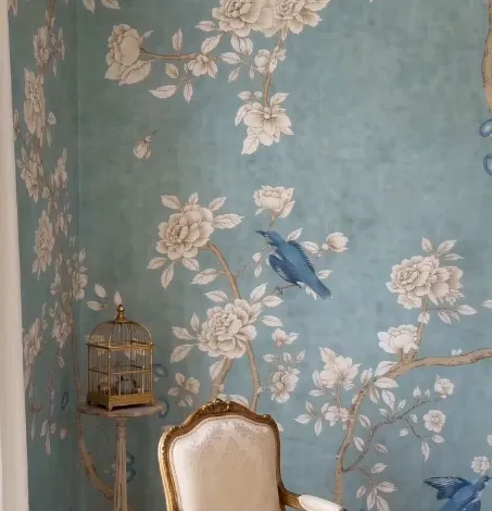
Calm, soft, a little bit fancy. This blue isn’t too bright and it isn’t too dark either, it just sits in that narrow, elegant middle ground that reads as lowkey luxury rather than trying to announce itself.
Chinoiserie has been doing exactly this since European decorators first started reinterpreting Chinese motifs back in the 1700s, birds mid-flight, branches curling across the wall, a pattern dense enough to feel rich without ever tipping into loud. That’s really the whole trick with a paper like this, it rewards a room that already has a bit of gold or brass in it, an ornate chair, a birdcage, anything that lets the wallpaper feel like it was always meant to be there rather than freshly hung last week.
The One With the Light Trick
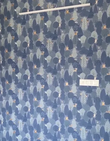
I picked this one for the list mostly because of what happens once the lights go on. That contrast against white light is doing real work here, whether it’s day or night, the wall genuinely reads differently depending on which one you’re standing under.
Small trees and tucked-away birds repeat across a deep navy field here, carrying a woodland feel that reminds me of a certain kind of home warmth, though I’ll admit that’s my own read on it more than a documented design origin. What I can say with more confidence is the practical part, dense repeat patterns like this hold up better in smaller rooms than a single large motif would, because the scale keeps working no matter how close you’re standing to the wall, and a warm wall light angled across it pulls the navy into something almost glowing after dark.
The One You Could Stare at Over Tea
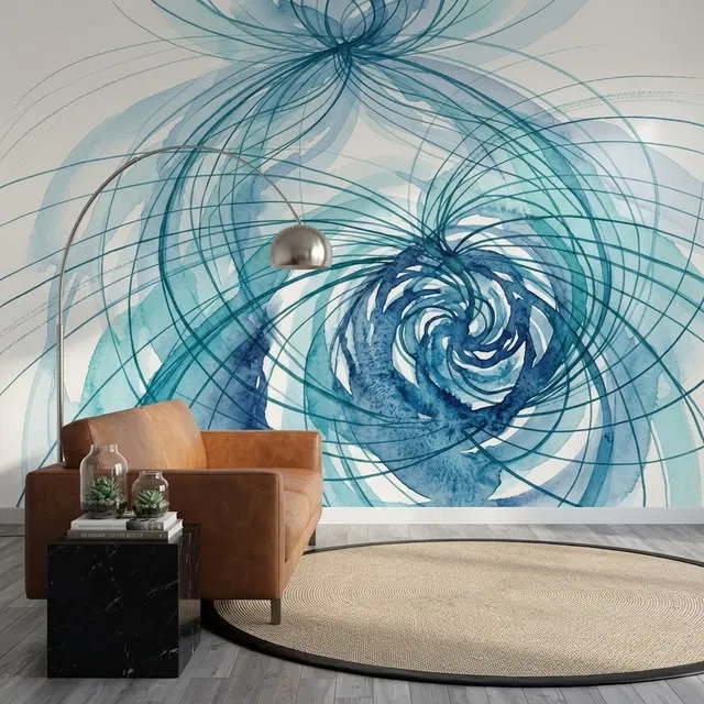
This one was originally shared by the Instagram handle @zenvanahome.us, nice choice, credit due where it’s due.
Shot in daylight, and you can actually see the depth in it, real depth, the kind that makes you notice how many layers of blue are stacked into what looks like one colour from across the room.
Now I know I’m being a bit of a deep-ak Chopra about a wallpaper here, but stay with me.
A large-scale abstract mural like this doesn’t work the way a repeating print does, it works the way a single piece of art works, one wall, one moment, nothing competing with it. Yeah, I know I’m being a little much about this, but I genuinely love it, because those spirals keep pulling the eye back in, deeper and deeper, the kind of thing where even sitting in the room with a cup of tea, your eye keeps drifting back to the centre of it without meaning to.
This One That Feels Like Ghar
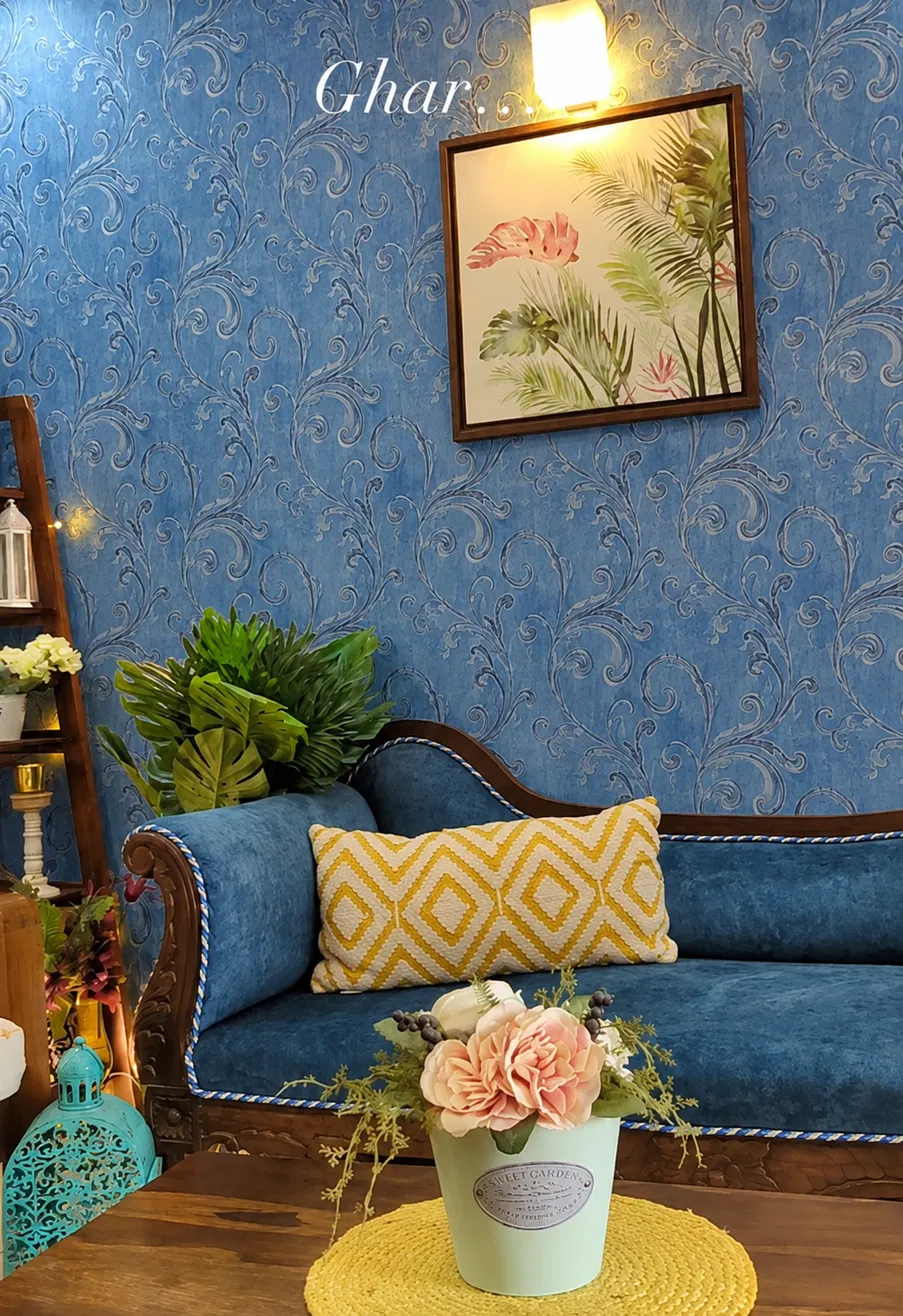
Ghar. If you’re from India, Pakistan, or Bangladesh, you already know that word means home, not house, home. And this exact blue, with the scrollwork running through it, is about as close as a wallpaper gets to depicting that feeling.
I’m fairly confident that if you’ve grown up around that culture, or spent real time in a home shaped by it, something about this image is going to land the moment you look at it properly. And if it doesn’t hit you right away, look again, it’s worth a second look. None of which means this is only for that audience either, the aesthetic itself, warm carved wood against a rich patterned blue, plants filling in the corners, works regardless of where you’re from. It’s just that for some of us, it means a little more.
This One Shot in Late Morning Light
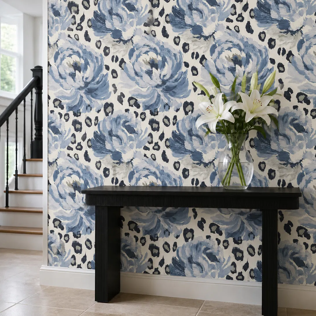
Somewhere around ten in the morning, going by the light in this one, that in-between hour where a room’s neither dim nor blown out, just properly lit.
This is also the boldest pattern on the whole list, mixing a soft floral against what’s essentially an animal print, roses and leopard spots sharing the same wall without fighting each other, because they were designed together rather than layered as two separate papers. And since we’re talking styling, that glass vase on the console table is begging for company. A little fish-shaped vase, maybe something in a soft lemon tone, would sit beautifully in that spot. Just don’t leave her on her own though, give her a mate. Loneliness kills, even for a vase shaped like a fish.
Now Put Something Real on That Wall
Blue wallpaper isn’t the finished room, it’s the backdrop the rest of the room gets to react against. And once it’s up, the piece almost everyone gets wrong is what to actually hang on it.
Match the wallpaper, don’t fight it. If the blue is soft and pale, like the chinoiserie in the first idea above, art in blush pink, pale wood, or soft grey stays in the same quiet register. Deep navy or midnight blue, closer to the Ghar-toned scroll pattern, wants the opposite, gold frames and warm tones, mustard, terracotta, olive, pull heat out of a colour that would otherwise sit cold on its own. Turquoise or teal leans best on coral, sandy beige, or brass to ground it.
Every Level Is The Rule!
Eye level is still the rule, wallpaper or not, centre the piece roughly 145 to 150 centimetres up from the floor, that’s the standard gallery height and it holds regardless of what’s behind the frame.
If the art is going above a sofa or a console, keep the width to somewhere between two thirds and three quarters of the furniture underneath it. Go smaller than that and it starts looking like it’s floating loose on the wall rather than anchored to anything. Hanging more than one piece together, treat the group as one unit rather than several separate ones, bottoms aligned, spaced eight to ten centimetres apart, centred over whatever furniture sits below.
When the Wallpaper Itself Is the Loud One
A plain blue wall gives you room to do almost anything. A patterned one, florals, stripes, anything busy, asks you to work smarter instead.
Simplify the art rather than matching its energy. If the pattern is small and repeats constantly, the way the chinoiserie or the woodland paper does, the art wants to be larger and simpler, not another small busy thing added to an already busy wall. A thick mat or a plain, neutral frame works as a buffer between the two, giving the eye somewhere to rest before it hits the pattern again. And if the wallpaper carries an accent colour inside its own pattern, cream flowers on blue, a touch of gold in a birdcage, pulling that same colour into the art’s frame or mat ties the whole wall back together without adding anything new to look at.
None of this needs to be complicated. Pick a wall art piece that either agrees with the wallpaper’s tone or knowingly contrasts it, hang it at a height that actually makes sense, and let the pattern behind it do the rest of the talking.
The one design I wanted to add but I have not is: Royal blue wallpaper, sophisticated and charming. “Laura Ashley Summer Palace Royal Blue wallpaper”
Royal blue wallpaper but it’s focused on washroom only, I am doing this addon here at the bottom maybe I liked it a lot and wanted to share with you guys.
 Decor & Improvement Accessories