

Home & Decor Blogs: DIY, Interior Design & Lifestyle Ideas
Best Ceramic Tile Backsplash Looks For Your Kitchen, Featuring clé Collection
A kitchen backsplash sits right where your eye lands first — between the countertop and the cabinets — and that strip of wall does way more visual work than most people realise. You could spend serious money on cabinetry and counters but if the backsplash is just whatever was cheapest at the tile shop the whole kitchen feels unfinished and you can not quite figure out why.
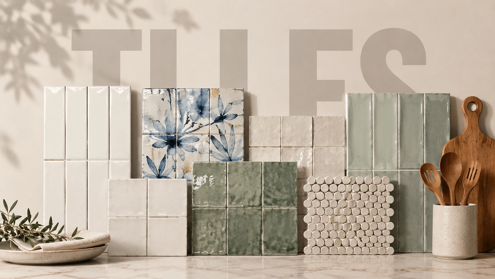
Ceramic tile is probably the most practical material for a backsplash because it handles heat, grease, steam, daily wiping, and it does not complain. But practical does not have to mean boring and that is kind of the whole point here. The best ceramic tile backsplash from clé is where things get interesting because the brand treats tile like an architectural surface with actual material character — glazes that shift in different light, pigments that vary slightly piece to piece, surfaces that feel genuinely handmade rather than stamped out of a machine. Seven looks worth knowing about, who each one actually suits, and where they belong in a real kitchen.
1. White Ceramic Subway Tile With a Sharper Layout
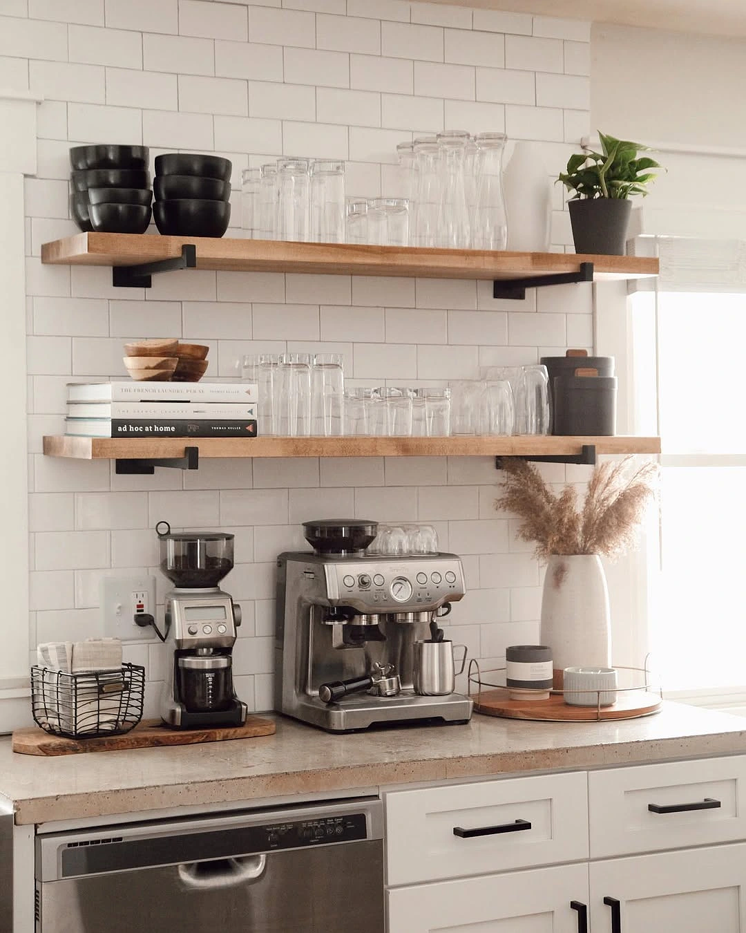
White subway tile gets recommended so much that people have started rolling their eyes at it which is honestly a shame because the problem was never the tile itself. The problem was how everyone was using it. A standard three by six running bond with bright white grout — that is what makes every kitchen look like it was flipped in 2014 and nobody touched it since.
The way to make it feel current is proportion and layout. A slim two by eight stacked vertically feels genuinely architectural, more like something you would see in a well-designed restaurant than a builder-grade renovation. A straight horizontal stack with tight joints reads clean and intentional. Even a four by twelve running bond feels completely different from the old three by six just because the longer format means fewer grout lines and the wall reads calmer overall.
clé’s ceramic classics come in white gloss and white matte across several sizes — three by six, four by eight, four by twelve, two by eight, six by six. Gloss is the right call if your kitchen is small or does not get much natural light because it bounces whatever light you have around the room and opens things up. Matte works better in kitchens that already have plenty of light and want something softer and quieter, pairs really well with oak cabinets and unlacquered brass hardware and honed stone counters where you want the whole composition to feel calm rather than shiny.
If you are someone who changes your mind about decor every few years white subway is the safest foundation because literally everything else in the kitchen can rotate around it. Selling a home? This is the backsplash that offends nobody and photographs well for listings. But if you want a kitchen with real personality this probably is not your tile, keep reading.
One installation detail that matters more than people think — center the layout behind the range or sink first then work outward. You want to avoid ending up with a thin sliver at a visible corner because it looks like the installer ran out of room. And grout colour is a bigger decision than most homeowners realise, matching grout makes the wall feel like one continuous surface, soft grey makes the grid visible, dark contrast makes a statement but you had better be sure you want that statement permanently because regrout is not a fun afternoon.
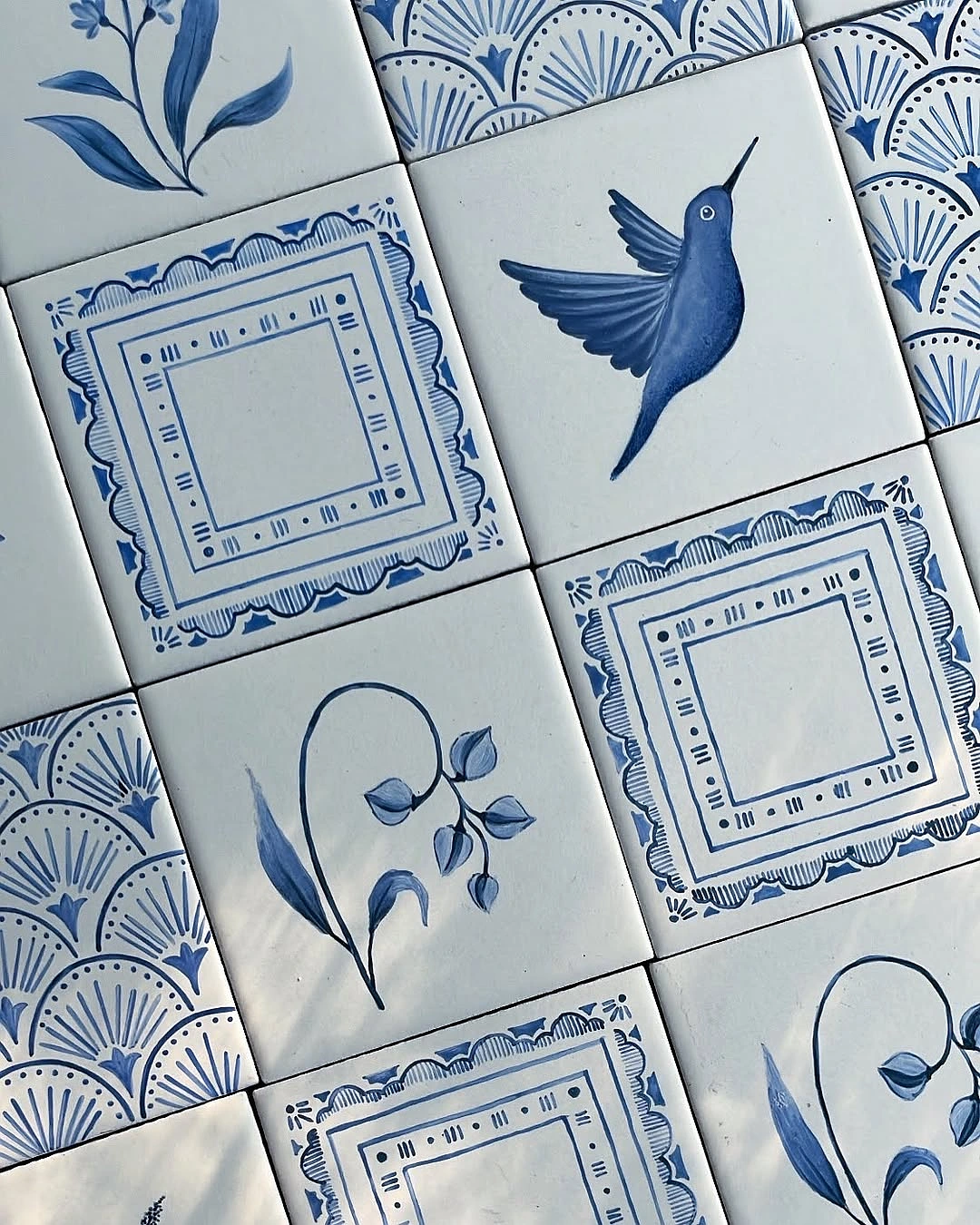
2. Hand-Painted Ceramic Tile for a Collected Feel
This is the tile for the person who walks into a kitchen and wants it to feel like it has a story. Not themed, not overdone, just layered in a way that makes you look closer at the wall. Hand-painted ceramic has brush marks and pigment shifts and tonal variation that you simply can not get from a machine-printed tile no matter how advanced the printer is and honestly once you see the difference side by side it is hard to go back to digital prints.
clé’s Watermark collection is the one worth looking at here. Deborah Osburn who founded clé conceived it around Japanese shibori — tiles get dipped and stained and washed with indigo and gold verdigris pigments so every single piece comes out different. You put thirty or forty of these on a wall and the effect is this quiet textural movement that feels alive without being loud, kind of like looking at water through glass where the light keeps shifting but the overall impression stays calm.
Where it works best is in contained zones — behind a range as a feature moment, on a short backsplash wall between open shelves, inside a coffee bar niche. You do not want to tile an entire kitchen in hand-painted ceramic because when there is too much of it the variation loses its impact and just starts looking busy. Used in one focused area it becomes the thing your eye goes to first when you walk in and everything else in the kitchen orbits around it.
This tile suits people who gravitate toward collected interiors rather than the matchy-matchy look where everything came from the same showroom in the same afternoon. If your kitchen already has a mix going on — soapstone counter, painted cabinets in some muted tone, open wood shelving, maybe brass or iron hardware — hand-painted tile actually ties all of that together because the tile itself already contains multiple tones. If you are the kind of person who needs everything perfectly uniform and aligned this will frustrate you and that is fine, the variation is the entire point and you either love it or you do not.
Pair it with simple counters. White quartz, honed marble, soapstone. Cabinetry in cream or charcoal or navy or clay. The tile is already doing a lot visually so the surfaces around it should stay quiet and let it carry the room.
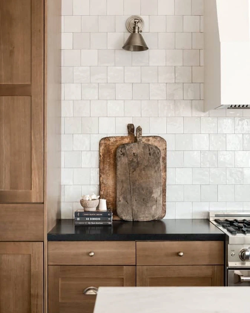
3. Square Ceramic Tile for a Clean Grid
Square tile is genuinely underrated. It does not have the novelty of a hexagon or the heritage association of a subway format, it just makes a clean honest grid on the wall and gets out of the way. That simplicity is exactly why it works in modern kitchens with flat-front cabinetry and slab counters and minimal hardware — the grid itself becomes the design detail instead of competing with one.
A four by four or six by six installed with tight consistent joints and grout close to the tile colour reads modern without trying hard. For a more graphic look you can go darker on the grout to outline every square but be careful with this in smaller kitchens because heavy contrast makes the backsplash feel busier than you probably intended and in a compact space that visual noise bounces around and makes everything feel smaller.
This is the tile for minimalists who still want warmth. Glossy white feels classic. Matte ivory softens it considerably. Pale blue or moss green or butter yellow or clay adds colour without the backsplash feeling trendy — and that distinction actually matters because trendy means you will want to rip it out in five years whereas a muted square grid in a thoughtful colour just ages quietly and still looks right a decade later.
Works best in kitchens where the cabinetry and hardware are not doing much visual heavy lifting. Handleless cabinets, simple shaker fronts, that sort of thing — the square grid gives the wall enough texture and rhythm to feel finished without competing. In kitchens that already have a lot happening — patterned counters, open shelving loaded with stuff, statement pendant lights — square tile calms everything down and honestly that might be exactly what the room needs, somewhere for the eye to land and rest.
4. Zellige-Style Ceramic for Light and Shadow
Zellige is popular right now and for good reason because it makes a kitchen feel alive in a way that flat uniform tile just cannot. The slight unevenness of each piece, the tonal shifts from tile to tile, that reflective glaze catching light differently depending on the time of day — your kitchen literally looks different at eight in the morning versus four in the afternoon and you did not do anything, the tile just does that on its own.
clé places zellige alongside ceramic, porcelain, terracotta, brick, cement, stone, terrazzo, and hexagon in their broader range which is actually helpful because a lot of homeowners get confused about where zellige sits in the material hierarchy. It is not quite porcelain, not quite standard ceramic, it occupies its own category and the main thing to understand is that it is intentionally irregular. If that sentence makes you nervous this is probably not your tile.
People drawn to Mediterranean kitchens, rustic modern spaces, organic interiors, anything that feels collected over time rather than purchased in one trip — zellige is for you. If you look at a perfectly straight grout line and feel deeply satisfied, probably not. If you look at a wall with slight undulation and think that is beautiful, this is the one.
Range walls are where zellige really shines because the cooking zone is usually the visual anchor of the kitchen and zellige gives it a depth that flat tile can not match. Also works beautifully in kitchens with arched details, open shelving, natural materials like wood and stone everywhere. The variation in the surface means it pairs well with other imperfect textures — rough-sawn wood shelf, leathered granite counter, hand-forged iron hardware. Everything feels like it belongs together because nothing is trying to be perfect.
One thing your installer absolutely needs to know — review all the tile before setting and blend pieces from multiple boxes to spread the colour variation evenly across the wall. If the installer treats zellige like standard ceramic and tries to make every piece perfectly level and flush the result looks wrong because they are fighting the material instead of working with it. This tile wants to be a little uneven, that is the whole appeal.
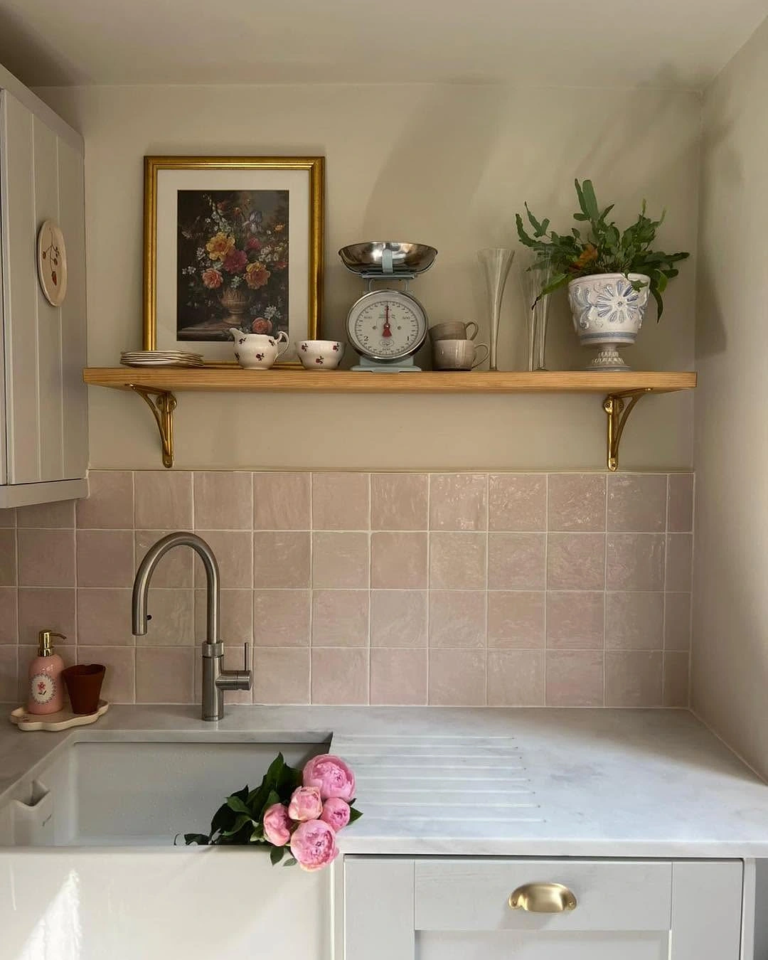
5. Soft Colour Ceramic for Warmth Without Pattern
A backsplash is honestly the easiest place to introduce colour in a kitchen because the area is contained and reversible. You are not committing to coloured cabinets that cost thousands to redo or a coloured countertop you are stuck with for a decade minimum. A backsplash you can change without gutting the room which makes it the perfect spot to be braver than you normally would.
Soft green, pale blue, muted pink, warm beige, tobacco, butter, clay — all of these bring warmth without making the kitchen feel loud. The thing that makes the difference though is variation in the finish. A perfectly flat solid colour tile can feel commercial, like something behind the counter at a chain restaurant, whereas a tile with subtle pigment movement and slight surface variation feels intentional and warm and like someone actually chose it for a reason.
clé’s whole material philosophy leans into this because the brand celebrates surfaces with individual character rather than perfect uniformity. Pick a soft green from a line that has glaze movement and you get a wall that reads as one colour from across the room but reveals depth and tonal shifts when you stand close and run your hand across it. That is the difference between colour that feels painted on and colour that feels like it belongs to the material.
The trick for anyone nervous about colour is connecting the tile to something already in the room so it feels grounded. Sage backsplash echoes a garden view through the window. Pale blue softens stainless steel appliances. Warm clay relates to wood floors or woven pendant lights or those terracotta pots you already have on the open shelf. When the colour has a reason to exist in the space it never feels risky, it just feels right and people walk in and think the kitchen looks good without being able to pinpoint exactly why.
Kitchens with natural light are where colour ceramic really comes alive because the tile changes throughout the day as the light moves and that shift is half the appeal. South-facing kitchen with a butter-coloured backsplash glows in the afternoon. North-facing with soft blue feels calm and collected even on overcast days. No windows at all? Lean warmer — beige, clay, tobacco — because cool colours without natural light can read flat and a little depressing which is the opposite of what you are going for.
6. Ceramic Tile Carried Full Height
Taking tile past the standard eighteen-inch backsplash height is one of the fastest ways to make a kitchen look more designed without changing anything else and honestly it surprises me how few homeowners think to do this. Extending ceramic to the bottom of upper cabinets or around a range hood or all the way to the ceiling creates an architectural quality that a standard backsplash strip simply can not achieve, the kitchen goes from looking like it has a tile apron to looking like it has a tile wall and the difference in presence is enormous.
clé specifically encourages thinking of the backsplash as a design opportunity rather than a minimum required strip and more homeowners need to hear this. A full-height tile wall behind the range with a statement hood mounted on it — that is not a backsplash anymore, that is the focal point of the entire kitchen. A sink wall without upper cabinets tiled to the ceiling feels intentional and custom rather than like someone just stopped tiling where the cabinets used to be and left a weird gap of painted drywall.
This suits homeowners who want the kitchen to feel built-in and architectural, especially if the layout already has one strong wall — a range wall or a sink wall without uppers — that can carry the weight visually. Also works really well in open-plan spaces where the kitchen is visible from the living area because the full-height tile gives the kitchen zone its own identity without needing a physical wall or divider to separate it.
But this is where details either make the whole thing or ruin it. Outlets need to be mapped precisely because a beautiful tile wall with a poorly aligned outlet cover plate looks careless and you will notice it every single day. Hood placement finalised before any tile goes up. Shelf brackets need backing support planned into the wall if you are doing open shelving on the tile. Edge finishing where the tile stops and painted wall begins — bullnose, metal trim strip, or wrapping the corner with tile — needs to be decided on paper with your installer before they crack open the first box. Skip this planning step and you end up with raw cut edges and awkward terminations that undermine everything the full-height treatment was supposed to achieve.
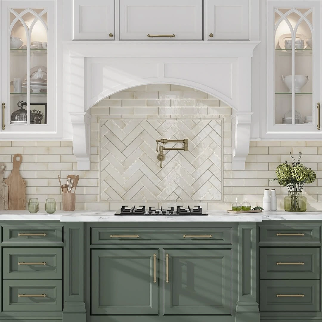
7. Mixed Ceramic Formats for Subtle Contrast
Using one tile everywhere is safe and there is nothing wrong with safe. But mixing two ceramic formats within the same colour family can make a kitchen feel like it was assembled thoughtfully over time instead of tiled in one session by a guy who opened one box and kept going until he ran out.
The approach is straightforward — standard subway or square tile across most of the backsplash, then a different format behind the range or inside a niche. That feature zone could be hand-painted tile, a penny round mosaic, a slightly different square size, a zellige piece with more surface movement. Because everything stays in the ceramic family the result is cohesive, you are getting contrast through format and texture not through clashing materials that fight each other.
This is for people who love the idea of a feature tile but do not want it everywhere. Practical way to use something premium — from clé’s artisan collections for example — in one focused area while the larger installation stays in a more budget-friendly ceramic that keeps the total cost reasonable. You get the visual impact of the special tile without paying to tile the entire kitchen in it which at clé prices adds up fast.
Where it works — range niches, arched openings, alcoves, coffee bars, wet bars. Any spot with a clear architectural reason to be different from the surrounding wall. The mistake people make is sticking the feature tile on a random flat section of wall with no framing, no niche, no shelf, no change in wall plane, and it just looks like the installer ran out of the main tile and grabbed whatever else was in the van. Give the feature moment a reason to exist and it reads as intentional.
Keep the colour palette tight. Two formats maximum unless you really know what you are doing. Grout colour needs to work with both tiles which sometimes means compromising on what is ideal for one to get something that is good for both. Pull all your samples and lay them on the counter together before ordering because tiles that look amazing individually can fight each other when they are side by side on the same wall and you do not want to find that out after the installer has already started.
Before You Commit
Glossy ceramic reflects light and wipes clean easily so it is the practical move near the range where grease actually lands. Matte feels softer and more contemporary but depending on glaze and colour it can show water spots or residue differently so ask for a sample and live with it near your sink for a week before committing.
Grout is just as important as the tile and most homeowners do not think about it until the installer asks what colour they want and they panic. Matching grout makes a calm surface. Contrast grout makes the geometry pop. For cooking zones ask about epoxy grout specifically because standard grout behind a range absorbs cooking oil and goes yellow within a year and then you are staring at discoloured grout lines for the next decade.
Finalise layout before the first tile goes up. Center behind the range, figure out where cuts land at edges and corners, check outlet positions, confirm how exposed edges get finished. Beautiful tile with a raw cut edge visible at the end of a run undermines the whole installation and it is the kind of thing that bothers you more every time you look at it.
Most ceramic tile is easy to maintain but handmade, hand-painted, crackle-glazed, and specialty finishes sometimes need sealing or specific cleaning products. Check the manufacturer’s guidance before you install not after because some sealers change the way the glaze looks and that is something you want to know going in rather than discovering when the installer has already sealed half the wall.