
Home & Decor Blogs: DIY, Interior Design & Lifestyle Ideas
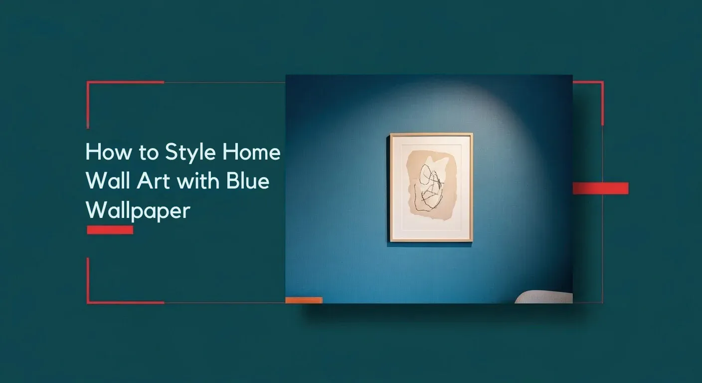
How to Style Home Wall Art with Blue Wallpaper
You walk into a room and your eye is immediately drawn to the wall rich, calming blue wallpaper spread across it like a gentle sea. Then you notice a beautifully framed piece of art floating effortlessly on that backdrop, the colors in the art echoing the wallpaper’s hue while standing out just enough to say “look at me”. That’s the magic we’re aiming for.
Styling wall art with blue wallpaper involves using contrasting colors for a bold look or complementary tones for a calming effect, adjusting for both the wallpaper’s shade and pattern. Consider the room’s mood and natural light, using large pieces as a focal point or grouping smaller items in a gallery wall.
Why Blue Wallpaper Works as a Backdrop
Choosing blue wallpaper gives your room a strong personality from the get go. Blue is versatile: it can feel calm and serene (think sky or sea), or rich and dramatic (think navy or midnight blue). According to design sources, blue wallpapers can “transform your living spaces whether it’s creating a serene retreat in the bedroom or adding warmth to the living room.”
Now, when you add wall art over that blue backdrop, the wallpaper becomes part of the storytelling not just a background, but a setting. That means your art needs to play nicely: neither vanish into the wall nor fight it.
Choosing the Right Art for Blue Wallpaper
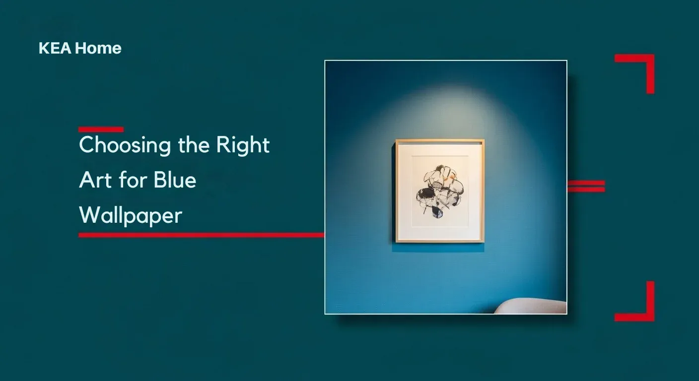
Match art Color with the backdrop:
When your wallpaper is blue, pick art that either echoes the blue or contrasts it. Echoing means selecting art that carries similar or complementary tones of blue so the overall feel is harmonious. Contrasting means choosing art in warm tones or metallic that stand apart making the artwork pop.
Consider the scale and style:
If your wallpaper is a solid or simple blue, you have more flexibility. But if the wallpaper has a pattern (we’ll talk about that later), the art should have a simpler or larger scale pattern so it doesn’t visually compete. According to one design tip: ensure the art has “negative space” around it so it stands out from the wallpaper.
Frame and mat thoughtfully:
The frame and mat (border around the art) act as a buffer between the art and the wallpaper. On a strong blue wall, consider frames in lighter tones (white, pale wood) or metallics (brass, chrome) to give visual separation. Matting gives that “breathing space” around the art.
Use varied materials:
Art doesn’t have to be just canvas prints. Consider textured pieces (e.g., rich acrylics, hand-painted surfaces), metalwork, or even textiles framed. The more texture, the more you add dimension when layered on a colored wall.
Personalize it:
Pick art that reflects your personality prints, photographs, paintings, even 3D wall art. The blue wallpaper gives the mood. The art gives the story. Together they make the room feel uniquely yours.
Placement & Hang Techniques
Eye level is still the rule:
Hang your art so its centre sits roughly at eye level (~145-150 cm from the floor) even with blue wallpaper, this remains the best starting point. It ensures the art interacts with the viewer naturally.
Leave “breathing room”:
Especially with color or patterned walls, give your art around it some empty space. That helps the art become a focal point instead of getting lost in the backdrop. From design advice: “make sure you have ‘negative space’ around the piece to visually separate the art from the wallpaper.”
Grouping and gallery walls:
If you’re doing multiple pieces, treat them as a single visual unit. On blue wallpaper, consider aligning the bottom of frames, keeping consistent spacing (e.g., 8-10 cm apart), and ensuring the grouping is centred on the wall or piece of furniture below it. The wallpaper may influence where you centre patterns or motifs in the wallpaper may suggest a natural centre.
Balance with furniture:
If your art sits above a sofa, console, or bed, make sure its width is roughly ⅔ to ¾ of the furniture width. On a bold blue wall, if the art is too small you risk it looking like it’s floating aimlessly.
Lighting matters:
On a blue wall, lighting can make huge difference. Consider directional lighting (picture lights, wall mounted spots) that create a little highlight on the art so it doesn’t fade into the color surface. This is especially helpful if the wallpaper leans dark.
Color and Texture Pairings
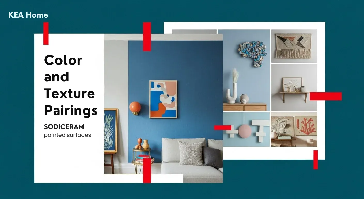
Warm vs cool contrasts:
Blue is a cool color. That means warm accents (brass frames, wood tones, terracotta elements) will stand out and feel inviting. On the flip side, cool metallics (chrome, silver) and lighter woods will emphasise a crisp, door modern look.
Texture layering:
If your wallpaper has a matte finish, add art pieces with glossy elements (glass, resin) or metallic touches. Conversely, if the wallpaper is shiny or busy, choose art with simpler texture and matte surfaces so you don’t overwhelm the room.
Material mixes:
- Canvas artworks: soft, tactile, informal.
- Framed prints: structured, clean.
- Metal or sculptural art: dramatic, adds dimension.
- Textiles or tapestries: relaxed, boho.
Pick based on your room’s vibe but be conscious of how the wallpaper’s material finish (matte vs glossy) will influence the art’s impact.
Color tidbits:
- Deep navy wallpaper: pairs beautifully with gold frames and art with warm hues (mustard, terracotta, olive).
- Sky or pastel blue wallpaper: works well with soft greys, white frames, blush pink or light wood.
- Turquoise or teal wallpaper: bold choice let the art have accents of coral, sandy beige, or brass to ground the look.
These combos are similar to color ideas found in blue wall art guides.
Dealing with Patterned or Bold Blue Wallpaper
If your wallpaper isn’t a plain single shade but has a pattern (stripes, florals, geometrics) or is a strong saturated blue, you’ll want to work a little smarter.
Simplify the art:
Pick art with minimal pattern or design so it doesn’t compete with the wallpaper. In design-talk: contrast the pattern scale if the wallpaper is small and busy, the art should be larger scale, bold in subject, and simpler in pattern.
Use a plain mat or frame buffer:
A thick mat or a frame in a neutral color creates a “break” between the art and the busy wall. This helps the art stand out.
Match your wallpaper’s rhythm:
If your wallpaper has vertical stripes, you might hang art slightly off-centre to play into the rhythm rather than fight it. If the pattern is large and architectural (e.g., big leaves or flowers), consider selecting art with smaller visual weight so it doesn’t get overshadowed.
Color pull through:
You can use color within the wallpaper’s pattern (for example if the blue wallpaper has white flowers) to pick art that uses those accent color’s. That creates a subtle tie back and makes everything cohesive.
FAQs
Q: Can I use multiple art pieces on a blue wallpapered wall?
A: Absolutely. Just follow the principles: keep spacing consistent, give breathing room around the group, ensure the wall art group behaves visually as one unit and remains harmonised with the wallpaper’s rhythm.
Q: What frame color works best with blue wallpaper?
A: It depends. For a modern look, white or light wood frames work great. For more dramatic rooms, brass or black frames can anchor the art. Avoid wood tones that are too dark against a deep navy blue unless you want a high contrast statement.
Q: My wallpaper is dark navy and I worry wall art will get lost. What to do?
A: Choose art with lighter backgrounds or metallic details so it pops. Use a light or metallic frame, and ensure lighting highlights the piece. You might also select art with some warmth (like ochre or terracotta) to balance the coolness of the navy.
Q: Does the wallpaper pattern type affect my art choice?
A: Yes. If the wallpaper has a large scale pattern (big florals, big geometrics), go with simpler, minimal art. If the wallpaper has a small scale pattern (tiny motifs, subtle texture), you can afford a bit more complexity in the art, but still ensure clear contrast.
Conclusion
Styling home wall art with blue wallpaper doesn’t have to be tricky it just requires a few deliberate choices. The blue wallpaper gives your room personality, and the art gives it story and focus. By selecting art that complements the backdrop, placing it thoughtfully, matching textures and colors with intention, and avoiding visual clutter, you’ll end up with a space that feels cohesive, creative and just your style.