

Home & Decor Blogs: DIY, Interior Design & Lifestyle Ideas
How to Design Grand And Luxurious Residential Spaces

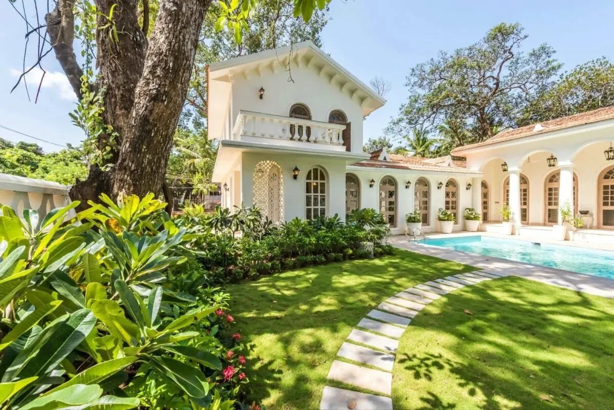
Somebody builds a 7,000-square-foot house, fills it with imported marble and custom cabinetry, and the whole place still feels like a hotel lobby. Not in a good way. You walk through it and nothing connects. The living room is enormous but uncomfortable. The kitchen opens into a dining area that somehow feels cramped despite being twice the size it needs to be. Everything is expensive and none of it works together.
So what is the difference between a big house and a high-end one?
Money is only a small part of it. It is judgment, the sort that knows a 10-foot ceiling reads one way in a wide room and completely another in a narrow one, and that where the light falls at four in the afternoon will matter every bit as much as the tile you spent three weekends choosing. A grand home that has been designed well feels effortless the second you walk in, and that ease comes from every decision in it having been made for a reason. You sort the function first and let it drag everything else along behind it, and the luxury more or less takes care of itself.
Get the Proportions Right Before You Pick a Single Finish
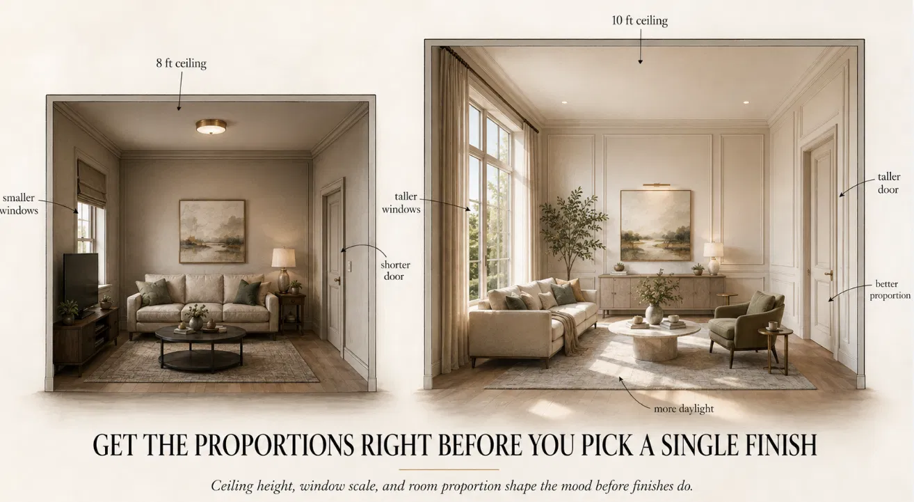
Proportion is the most tedious of all the subjects, next to finishes and furniture, yet it is the one thing that separates great architecture from the merely expensive sort. A ceiling’s height, a room’s width, the area of its windows, a door’s proportions: these things settle the mood of a place long before the furniture arrives to sit in it.
Ceiling height is at the top of the list. Building codes set 8 feet as the standard and most homes built before the 1980s stayed at that height, yet luxury house plans now work at 9 and 10 feet. It is not just a little difference, it is real money. The National Association of Home Builders has found that homes with 9-foot ceilings sell for an average of 6 percent more than homes with 8-foot ceilings, and one study put that closer to 11 percent in the Dunwoody area of Atlanta.
Money aside, have you ever noticed your own head feels clearer in a room with a high ceiling? There is research behind that.
A 2007 study conducted by Joan Meyers-Levy and Rui Zhu for the Journal of Consumer Research found that people tend to be more freewheeling and abstract in their thinking under a higher ceiling, and more narrow and detail-oriented under a lower one. Your brain changes its thinking pattern based on how much space sits above your head, and in a home dedicated to relaxing and thinking, that is a lot to leave to chance.
But taller is not automatically better, and this is where the money gets wasted
Drop a 14-foot ceiling over a skinny little room and congratulations, you have built a very fancy elevator shaft. That feeling of openness never came from height on its own, it comes from the ratio between the height, the width and where you put the windows, and getting just one of those three wrong throws the whole room off however eye-watering the price of every surface in it.
Sightlines are architecture before they are decoration, so settle them while they can still be changed. Look at the entry on the plan and ask where your eye is drawn. To the garden seen through a distant window, to the stair with its clean geometry, to the double-height room opening up ahead. That first visual pull sets the tone for the whole house, and it is locked in architecturally rather than fixed up later with some clever piece of furniture. The best of these houses run a clean axis straight from the front door through to the view beyond, so the full depth of the property lands on you the instant you cross the threshold.
Plan the Floor So Rooms Can Be Related, Not Just Placed
More square footage laid out poorly just buys you rooms you cross to reach other rooms. A big house magnifies a weak plan, because whatever is mildly inconvenient in a 2,000-square-foot house becomes properly maddening in a 5,000-square-foot house. The point of a well-worked mansion floor plan is not to have as many rooms as possible, but to relate the rooms you do have to each other.
Separate the public and private halves clearly
The public-private split is the key part of any good plan. Those entertaining spaces, the kitchen, the dining, the living, the way out to the terrace, all flow together on the main floor so nobody has to ask anybody how to get to the powder room. The bedrooms, the offices, the family rooms belong in another wing or on another level, and that boundary should live in the architecture, not get enforced by shutting doors. The cleverest version I have seen keeps the main floor working as a single-level home day to day, with the gym, theatre, bar and spare bedrooms tucked below on a level you visit once or twice a week and forget about the rest of the time.
This is more than a plan view, so imagine it three-dimensionally
Sound is what people forget in nearly every floor plan I have watched go wrong, because they design staring down at a flat drawing and never picture what sits above and below each room. The same acoustic disasters keep turning up in big homes:
- The media room sits under the main bedroom, so every time the movie bass thumps, it thumps up through the floor.
- The home gym backs onto a formal dining room, so the weights and the treadmill run right through the dinner party.
- Then there is the open kitchen next to a home office without a door, the blenders and the phone calls carrying into everything.
- And the kids’ playroom goes over the living room with no subfloor insulation between them, which needs no further explaining.
Picture what sits above, below and beside every room, not only what it touches on the plan.
Service circulation is the other quiet divide between a house an architect designed and a house square footage designed. Can you carry the groceries from the garage to the kitchen without crossing the living room, run the laundry without crossing into a public entertaining space, and move from floor to floor on a secondary stair without touching the main entry? In a house over 4,000 square feet these stop being luxuries and become requirements, and you feel their absence every single day you live there.
Make the Entry Reveal the House Slowly

The foyer eats money for very little return. Three-storey ceilings, a gaudy chandelier and marble floors that echo are all very bank-lobby-ish, and rather than wealthy it reads as budget. What works instead is sequence, the house showing itself in stages rather than throwing everything at you the second the door opens.
The driveway should build the facade up to you rather than dumping the whole house at once, and then a portico with honest proportions, good stone, real timber and clean lines carries presence without showing off. Past that, the foyer opens on controlled natural light and one confident element of design, not five, whether that is a stair with beautiful joinery, a sculptural pendant, or a well-framed view through to the garden. The floors must be real too, stone underfoot and solid wood at the door, because people pick up the difference between the genuine article and a good fake within seconds even when they could not explain how. And the best houses hold something back, offering a glimpse of the rooms beyond so the house reveals itself as you move through it rather than spending its whole effect in the first ten feet.
Choose Materials That Get Better With Age, Not Worse
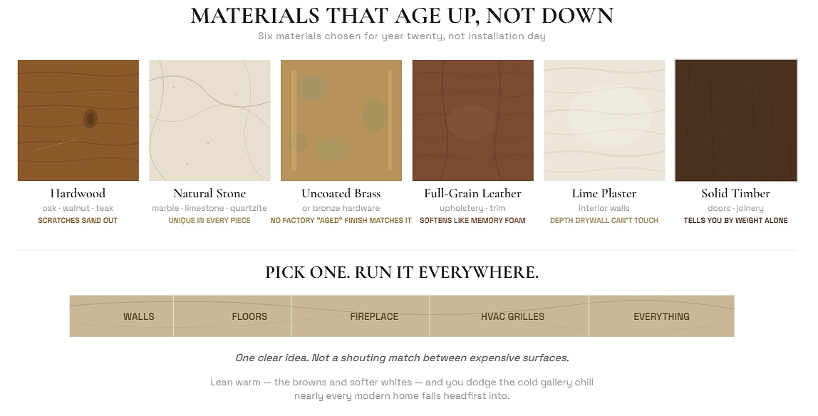
Expensive houses get this backwards constantly. Everything gets chosen for how it looked on installation day, the glossiest surface, the most flawless grain, the shiniest hardware, and five years later that showroom perfection reads as tired rather than lived-in. The materials worth your money are the materials that get better with use.
- Hardwoods such as oak, walnut and teak develop richer tones, scratches sand straight out, and a good hardwood floor will outlast you.
- Natural stone, whether marble, limestone or quartzite, is unique in every single piece and gains a patina from use that improves the finish.
- Uncoated brass or bronze hardware develops a natural patina that no factory “aged” finish can match.
- Full-grain leather behaves a little like memory foam, in that the longer you use it the more comfortable and better looking it becomes.
- Lime plaster walls have a depth and texture that painted drywall can never approach, and they get better with age.
- Solid timber doors and joinery tell you what they are by weight alone, the moment you close one.
There is one thing I would borrow from the best modern houses, and it costs nothing. Restraint in the sheer number of materials: pick one and run it everywhere. Push a single Turkish travertine through the walls, the floors, the fireplace, right down to the HVAC grilles, and the whole house suddenly reads as one clear idea instead of a shouting match between expensive surfaces.
Lean into the warmth living inside that stone, the browns and the softer whites, and you dodge the trap nearly every modern home falls headfirst into, the cold gallery chill nobody actually wants to live in.
And do not let anyone tell you durability is a budget-home problem. If your gorgeous marble counter cannot survive a spilled glass of red without a minor household emergency, it is the wrong stone for a kitchen, because a luxury home you have to tiptoe around like a museum is not really working for you.
Light the House in Layers

If you have got one overhead light in a big room, there is always a flat deadness to the space, those ugly shadows in the corners, and that horrible sense of turning into a commercial office at two in the morning. The answer is layers, and there are three of them.
Ambient light is the warm, even light across the whole room. Task light is wherever you are doing something, in front of your reading chair, at the kitchen counter, at your desk. Accent light picks out what deserves noticing, the artwork, a textured wall, some architectural detail. Put every bit of it on dimmers, because a living room under a 12-foot ceiling has to feel bright and open through the afternoon and then warm and low after sunset, and only a dimmer carries a room across that gap. Wall sconces soften a dining room around the edges of the central fixture, and perimeter light turned down in the evening brings even a soaring volume back to something intimate.
Then there is daylight, the one you cannot fix afterwards. Window placement, window size, orientation, how a room faces the sun, all of it is decided at the architecture stage of the project, and no lamp on earth saves it later. A west-facing living room that takes blinding glare every evening, an east-facing bedroom that wakes you at five-thirty every morning all summer, these are not faults of decoration but of design. Get the connection to real daylight wrong and you feel the fault even if you cannot put your finger on it, which is why a skylight, an atrium or one well-placed window doing that job belongs in nearly every room.
Make the Technology Disappear
The smart-home market grew to $127 billion in 2024 and is growing quickly, and at this level of build the integration is simply expected. Vivint surveyed consumers and found that 62% felt smart features raised a home’s resale value. High-end clients in Manhattan, Miami and the Hamptons put an average of 5 to 10% of a property’s value into technology, so in a 5,000-square-foot house that is $100,000 to $300,000 for the full smart-home system.
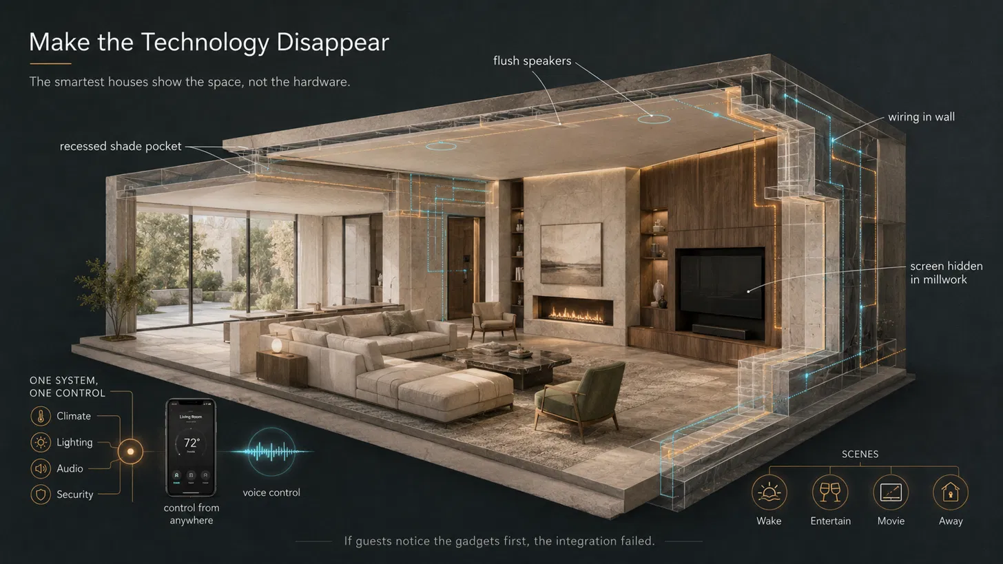
All that money is only well spent when the technology disappears into the house, which means you walk in and do not see the panels and wires and devices on every wall. Done properly it looks like this:
- The speakers are flush-mounted into the ceilings and not visible from below.
- The wiring is run through the walls during construction, rather than retrofitted.
- Motorized shades pull into recessed pockets in the ceiling.
- Screens recess into cabinetry or furniture when they are not in use.
- All systems for climate, lighting, audio and security are integrated.
- Voice commands and phone control replace the wall of panels.
Pre-set scenes like a wake-up, an entertain, a movie and an away are now standard in high-end builds, so people can run a complicated system without once thinking about the machinery under it. If your guests notice your technology before they notice your space, you have already made a mistake.
Carry the Design Past the Exterior Walls
A great house that quits at the exterior wall throws away maybe a third of what it could be. Outdoor living spaces are real rooms, people eat in them, people gather in them, people lose whole evenings to them when the weather cooperates, and the returns on getting them right make the case on their own.
Here is roughly what the different outdoor features give back:
| Feature | Typical ROI | Worth Knowing |
|---|---|---|
| Patio, built from scratch | 80–100%+ | Higher when it is designed for entertaining |
| Patio, refurbished | Up to 500% | Low spend, big jump in perceived value |
| Outdoor kitchen | 100–200% | Best returns in warmer climates |
| New wooden deck | ~80% | Composite and pressure-treated lumber last longest |
| Deck repair | Up to 400%+ | A fraction of new-build cost |
| Fire pit or fireplace | 50–78% | Stretches the outdoor season into cooler months |
| Pergola | ~50% | Prefab options cut install costs sharply |
A covered terrace lets you host a dinner whatever the sky decides to do that evening, and an outdoor kitchen with a proper grill, sink and refrigerator kills those maddening trips back indoors halfway through a party. If resale is anywhere on your mind, do skip the niche stuff like a wood-fired pizza oven that the next owner will probably shrug at. The real gain, though, is continuity. Match your interior flooring tones to the hardscaping outside, add wide glass openings or a folding wall system, and the hard line between the living room and the terrace quietly disappears. The terrace stops being a thing bolted onto the back of the house and starts working as part of the room, and the whole property feels bigger for it.
The part that never shows up in a valuation
Treat the outside as another room worth designing, some of it open to the sky, some tucked under a trellis that breaks the light into stripes, and you buy yourself one of the quiet luxuries of a well-made house, which is sitting out there on a warm evening watching the shadows crawl slowly across the floor and up the wall as the sun drops.
Landscaping is what ties the whole thing off, native plants that actually want to live in your climate, stone paths and low retaining walls for a bit of structure, and outdoor lighting placed to steal a few more usable hours out of the evening. Your outdoor rooms deserve to feel as deliberately designed as the interiors, because in a house that was planned properly, they genuinely are.
What It All Comes Down To
Before you fall for the next flawless finish or a ceiling a foot taller than the room needs, there is one question worth asking, and it predicts fairly well whether a house will still feel impressive in ten years. Did somebody sort the proportions before choosing a single surface? A house where the answer is yes tends to get the rest right as well, because the same thinking runs through the layout, the materials and the wiring in the walls. That coherence is the thing a bigger budget will not buy you. It comes from making fewer and smarter decisions, and from being honest, sometimes uncomfortably so, about how you actually live in a space rather than how you imagine you might.
 Decor & Improvement Accessories