
Home & Decor Blogs: DIY, Interior Design & Lifestyle Ideas
5 Wallpapers Everyone Is Hanging This Year, And What Actually Changed

I kept seeing the same 5 papers. On the coffee table in the September issues, in the show my mother has been rewatching, in the hotel everyone photographs in Beverly Hills, and then, which is the part that got me, in the hallway of a house 3 streets over that went up for sale last month. So I stopped scrolling past and went and found out what they are, because “wallpaper is back” is not news to anyone, but which 5 papers, and what is different about them from the stuff that was on walls 10 years ago, that is worth an afternoon.
Real names, where I saw them, and what changed. Number 2 is not mine, someone handed it to me, and I will say who when we get there.
Artist’s Stripe by House of Hackney

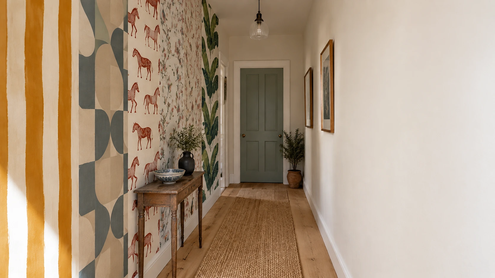
A stripe, and the line wobbles. That is the whole thing and it is why it is everywhere. House of Hackney in London put this out last year and Livingetc’s editor called it one of her favorite releases of the year, and every 2026 forecast I have read has “hand drawn lines” near the top with this paper as the picture. The Amber colorway is the one you are seeing most.
What changed is 100 years long. A wallpaper stripe has been a machine line since the machines arrived, perfectly straight, perfectly spaced, and this one is showing you the hand that drew it, the slight wander, the place the brush thinned. It looks like a person did it, which is the exact thing walls have not looked like since roughly 1920. I like it a lot, and I say that as someone who has been suspicious of stripes her whole life because they read as a hotel corridor. This one reads as a study where someone actually reads. Do you guys like it too, or is the wobble bothering you? I have had both answers at dinner.
The Arconia Hallway Paper by Schumacher

This is the one from Only Murders in the Building, the geometric in the Arconia hallways, soft blues and warm neutrals, and with season 5 having just run it is the paper people are walking into showrooms and describing with their hands. The building is real, it is the Belnord on 86th and Broadway, and the paper is real too, it is not a set piece, it is pulled from a hand printed 1960s design in the Schumacher archive, which means you can buy it.
I would not have listed this one on my own, and I want to be honest about that. Kris A. has been a subscriber here since our Demon Slayer wallpapers post, of all things, and when I was putting this list together I emailed her to ask if there was a paper I was missing, because she is the lead installer at Enjoy The Wall, the modern wallpaper installers in Denver metro, and she is seeing what goes up in real hallways. She came straight back with the Arconia paper and said people had been asking her about it since the season aired. So I went and dug into it, found the Schumacher archive story, found the Belnord, and yes, it earns its place. Thank you, Kris.
The reason it is on the list is what it changed about what a geometric is for.
A geometric on a wall used to mean small, tight, and a little corporate, the paper in a dentist’s waiting room. This one is big, the color is quiet, and it is doing the job a painting does in a hallway with nothing else in it. That is the difference, and it is why it works in a 1908 building and a 2019 one.
Zebras by Scalamandré

Red zebras, drawn for Gino’s restaurant in New York in the 1940s, and then the powder room in The Royal Tenenbaums, and then every maximalist room on earth since. If you have seen a zebra on a wall in the last 20 years it was this one or a copy of it.
The change with this one is that nothing changed, and I mean that as the point. 80 years and it is still being hung, and the trade forecasts for 2026 have animal print at the top of the list, so it is having a moment again at 80 the way it did at 40. Where it goes is where it has always gone, and I would keep it there:
- A powder room, because it is the 1 room where you can go all in and no one has to live with it.
- A small hallway, floor to ceiling, which is the Tenenbaums move.
- Never the bedroom, and I have seen it tried.
Strawberry Thief by Morris & Co

William Morris drew this in 1883, thrushes stealing strawberries from his own garden in Oxfordshire, and it is currently going up in new build apartments in colors Morris never saw. Country & Town House has it under “contemporary heritage” in their 2026 list, the Wallpaperdirect forecast has Morris under “romantic maximalism,” and House of Hackney has been pulling designs out of the Morris archive and recoloring them loud, which is how a Victorian block print ended up in a downtown loft.
Is it too much for a normal house? That is what everyone asks and the answer is it depends on the color. The original indigo and red is a lot, it is a dining room paper, a paper for a room you are only in for 2 hours at a time. The recolored versions, the pale ones on a chalky ground, are going in bedrooms and looking calm, which a paper this busy has no right to do. What changed is the ground, not the birds. Morris drew it dark. The 2026 versions are drawing it light, and that is the whole difference between a museum and a bedroom.
Martinique by CW Stockwell
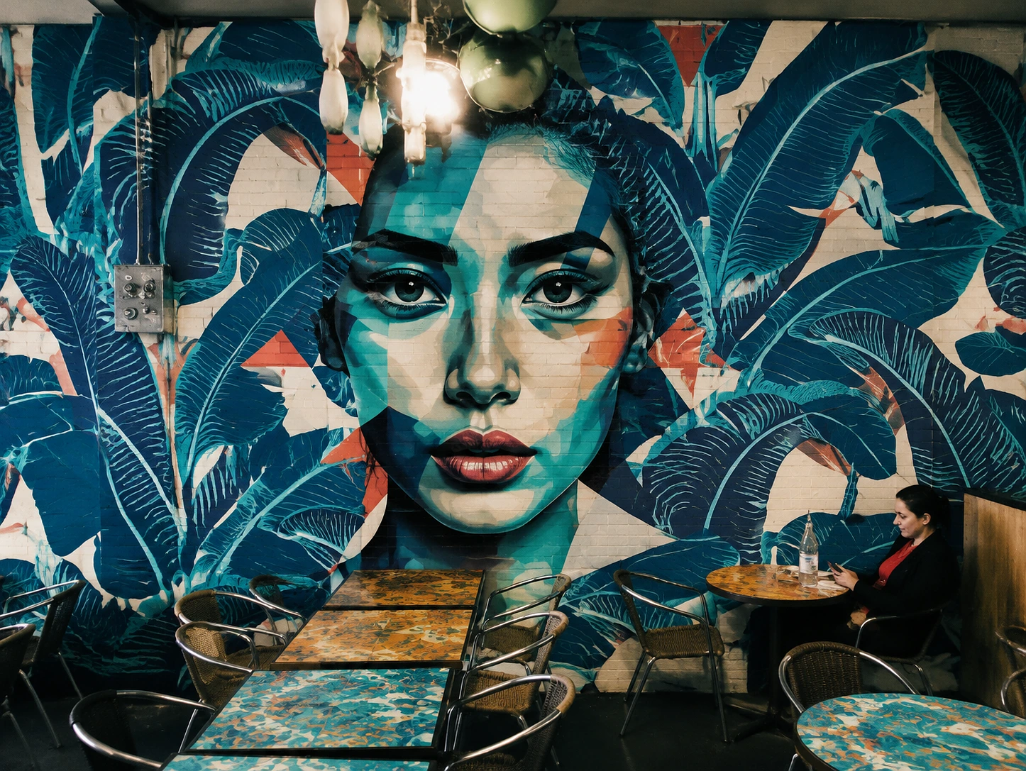
The banana leaf at the Beverly Hills Hotel. It has been on the walls there since the 1940s, it is the most photographed wallpaper in America by a distance, and every tropical leaf print sold since is a descendant of it whether the maker admits it or not.
For most of my life this paper was a hotel joke, a thing you saw on a Palm Springs postcard, and the change is that it moved indoors, into real living rooms, and the forecasts are calling that “outdoors indoors” and putting nature prints at the top for 2026. The paper did not change, the rooms did. A living room with pale floors, cane furniture and 1 wall of Martinique behind the sofa is reading as calm now, and 15 years ago the same room would have been read as a theme. I like it on 1 wall and I would not do 4, and the house 3 streets over did 4, which is probably why it is still for sale.
That is the 5. 2 of them are older than anyone reading this, 1 of them came off a TV show, and the newest one is a stripe that cannot draw a straight line, and all 5 are on real walls right now, which is the only trend report I trust.
 Decor & Improvement Accessories