
Home & Decor Blogs: DIY, Interior Design & Lifestyle Ideas
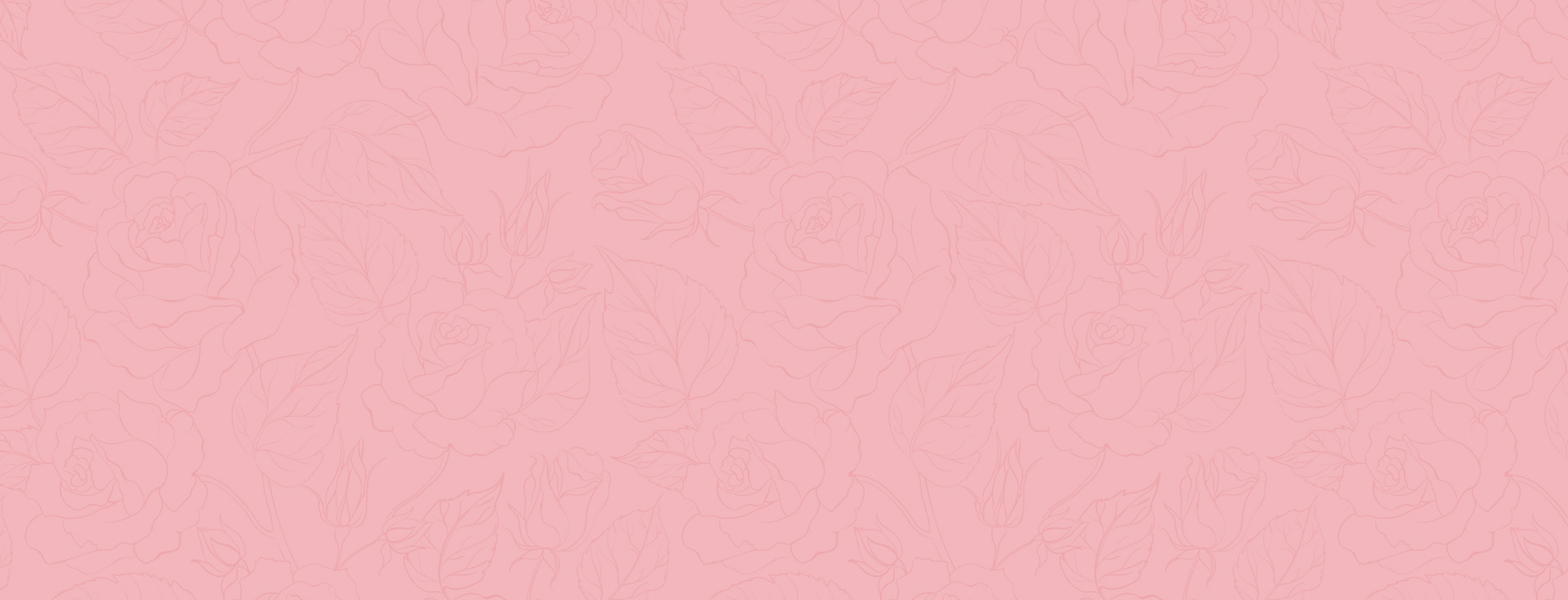
6 Modern Bathroom Design Ideas for Stylish Wall Finishes
The wall finish you pick for your bathroom does more work than any other surface in the house. It handles steam every morning, takes direct water spray if it’s near the shower, builds up soap residue and hard water spots that nobody notices until the grout starts yellowing, and still has to look good enough that you don’t regret the choice two years in. Most people pick based on a photo and end up living with the maintenance consequences.
The six bathroom design schemes mentioned earlier are not only visually viable but also possess practical utility in real-world domestic scenarios where ordinary users never wipe down their shower walls after showering.
1. Large Format Slabs With Almost No Grout Lines
Tiles sized 800×1600mm or larger do something that smaller tiles physically cannot — they cover a full shower wall in two or three pieces instead of thirty. That means two or three grout lines instead of dozens, and grout is where every bathroom wall problem starts. Mould, yellowing, cracking, staining — all of it lives in the grout.
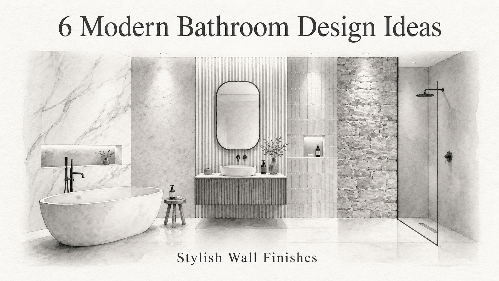
Large format porcelain slabs in the 1200×2400mm range can cover a standard shower wall, floor to ceiling, with a single piece per section. This type of seamless bathroom surface that uses very little grout can make a bathroom feel more open and tidy. Its core advantage is its long-term practicality: it reduces the workload of cleaning sealed joints, and also avoids the problem of having to re-grout the joints five years later, which arises when edge-sealing silicone sealant peels away from its edges.
The trade-off is installation. You cannot DIY large format slabs unless you genuinely know what you’re doing because they weigh significantly more than standard tiles and they crack if the substrate isn’t perfectly level. A 1200×2400mm porcelain slab weighs roughly 35 to 40kg per piece and requires two people, suction cup lifters, and a substrate that’s been levelled with self-levelling compound beforehand. The installer cost runs higher than standard tiling but you save it back on reduced grout maintenance over the life of the bathroom.
2. Vertical Layouts That Make Low Ceilings Feel Taller
This one is more about installation direction than the tile itself and it’s surprising how much difference it makes. The same 300×600mm tile laid horizontally makes the room feel wider. Flip it vertical and the eye follows the long edge upward, which makes the ceiling feel higher.
In bathrooms with standard 2.4m ceilings — which is most bathrooms in most homes — vertical layout adds the perception of maybe 15 to 20cm of extra height. Not a dramatic transformation but enough that the room feels less compressed, especially if the colour is light and the grout is colour-matched so the lines don’t interrupt the vertical pull.
Where this works best is the wall directly facing you when you walk in. That’s the wall your eye hits first and where the vertical effect registers. Doing all four walls vertical can actually feel odd, almost like the room is stretching, so most designers limit it to one or two feature walls and keep the remaining walls in a complementary horizontal or square format.
3. Geometric and 3D Tiles on One Wall Only
Many people have encountered tiles featuring geometric textures or three-dimensional reliefs in building material showrooms, where these tiles perform exceptionally well under the spaces’ professional controlled lighting. However, when installed in a residential bathroom, the actual appearance of such tiles is entirely shaped by their installation location and
the angle of incident light. The single-wall rule for home interior renovation is highly logical: tiling an entire bathroom with these tiles creates visual noise, as every surface competes for attention and leaves the space cluttered. If these tiles are only used to build a decorative accent wall behind the washstand or on the rear wall of a walk-in shower,
they can create a distinct focal point without crowding the space. For tiles with angular faceted surfaces, side lighting produces dynamic layered depth through shadows, while direct lighting from ceiling-mounted downlights eliminates those shadows due to its even light distribution, resulting in a dull, lifeless look. If you’re spending extra on textured tiles and then installing a single ceiling light directly above them, you’ve cancelled out the effect you paid for.
Cleaning is the other honest consideration. Every ridge and groove in a 3D tile is a place where soap scum and mineral deposits collect. In a shower area with hard water, this becomes noticeable within weeks. Flat geometric patterns with subtle surface variation give you the visual interest without creating maintenance traps.
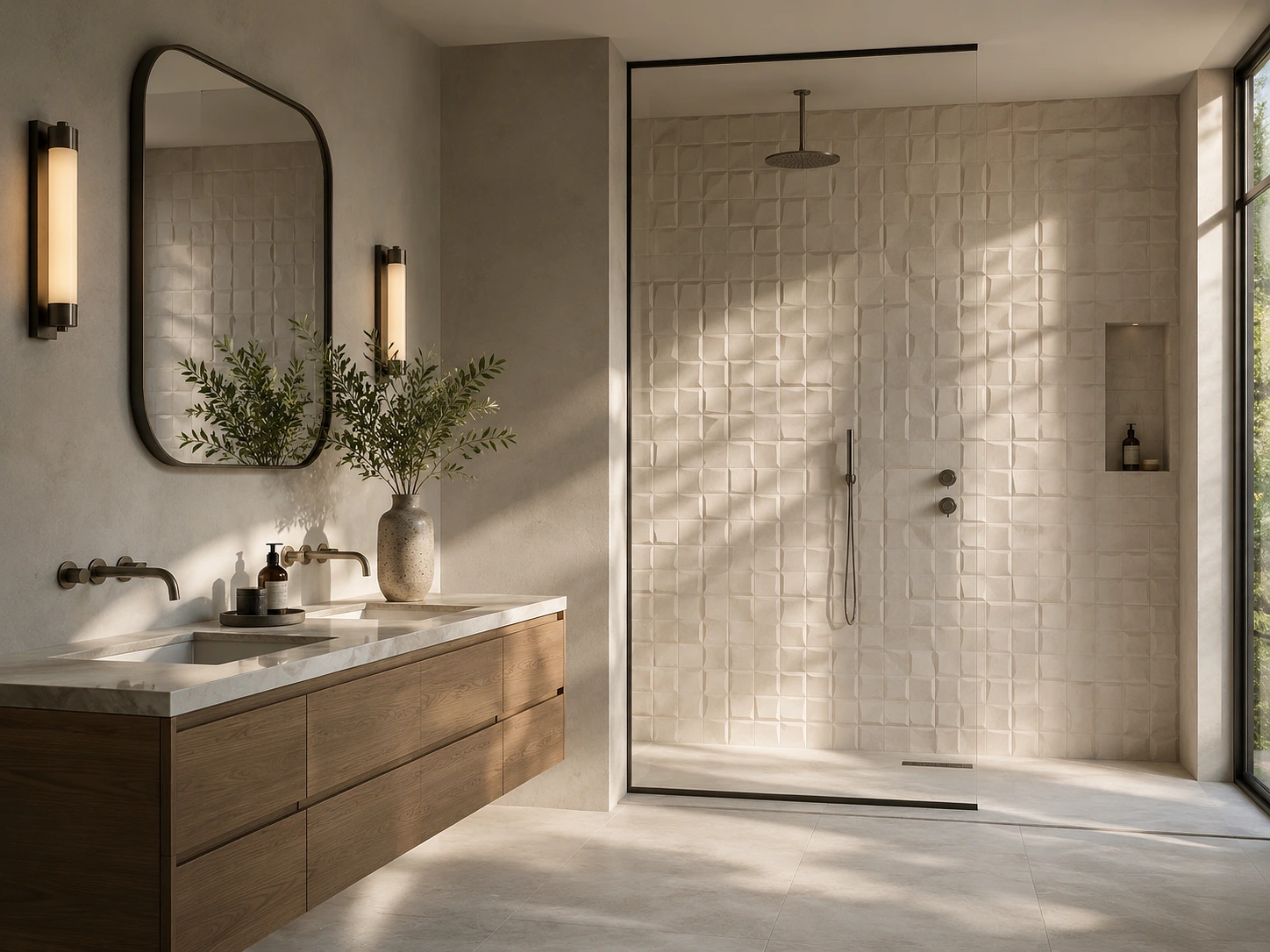
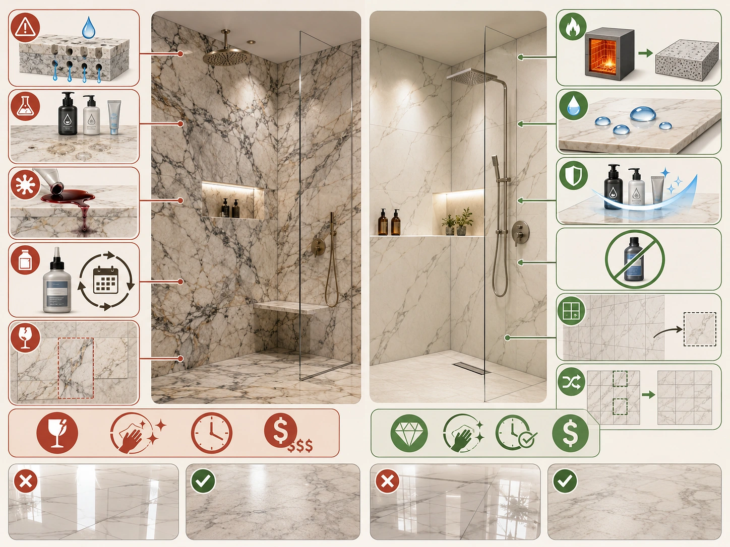
4. Marble-Look Porcelain Instead of Actual Marble
Real marble in a bathroom is beautiful for about eighteen months and then reality sets in. Marble is porous, it etches when it contacts anything acidic — shampoo, body wash, even some toothpastes — and it stains if it’s not resealed every six to twelve months. The veining that makes it gorgeous also means every slab looks different, so matching replacements later is nearly impossible.
shower. Mainstream marble-imitating tiles adopt a vitrification process. After high-temperature firing, their base body is nearly non-porous, with a water absorption rate lower than 0.5%. These tiles can resist corrosion from household chemicals and never require glaze sealing treatment over their entire lifespan.
The technology has reached a point where the printed veining on good quality porcelain is genuinely difficult to distinguish from real marble at conversational distance. The giveaway is usually the repetition — manufacturers work from a set of face designs, maybe eight to fifteen unique patterns per range, so if you’re tiling a large wall you might spot the same vein pattern twice. The workaround is buying from ranges that offer more face variations and asking the installer to randomise the layout so identical faces don’t end up adjacent.
If you’re comparing options across different bathroom tile design collections, marble-look porcelain in a matte or soft-lapped finish tends to look more convincing than high-gloss versions because real marble isn’t mirror-shiny either — it has a natural soft sheen that matte porcelain replicates better.
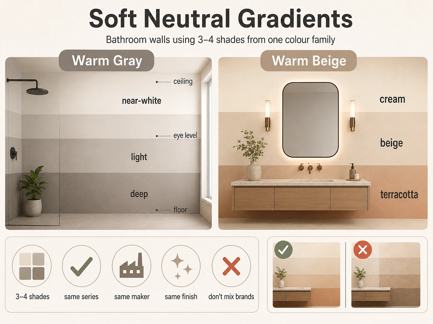
5. Soft Neutral Gradients Using the Same Colour Family
For wall design in bathroom spaces, it is recommended to abandon the uniform single-color scheme applied across the entire wall, and instead select 3 to 4 shades from the same color family to create a gradient effect. This approach not only adds a sense of depth to the space, but also avoids creating visual clutter. Two sets of compatible gradient transition cases can be referenced: for the warm gray set, the color shifts from a deep tone at the floor, a light tone at average human eye
level, to a near-white tone near the ceiling; for the warm beige set, the color shifts from a terracotta-adjacent tone at the base to a cream tone above the vanity mirror. This design is subtle enough that most people entering the bathroom will not detect it is a deliberate arrangement, and will only intuitively perceive the space’s warmth and layered quality, which aligns with the core design logic: an excellent wall
finish must integrate into the overall spatial experience, rather than intentionally draw attention to itself. When implementing this design, it is required to select tiles from the same series produced by the same manufacturer; even with color variations, this keeps the finish and texture consistent. If tiles from different brands or series are mixed, subtle differences in gloss and texture will disrupt the gradient atmosphere, reducing the design to a haphazard, cobbled-together work.
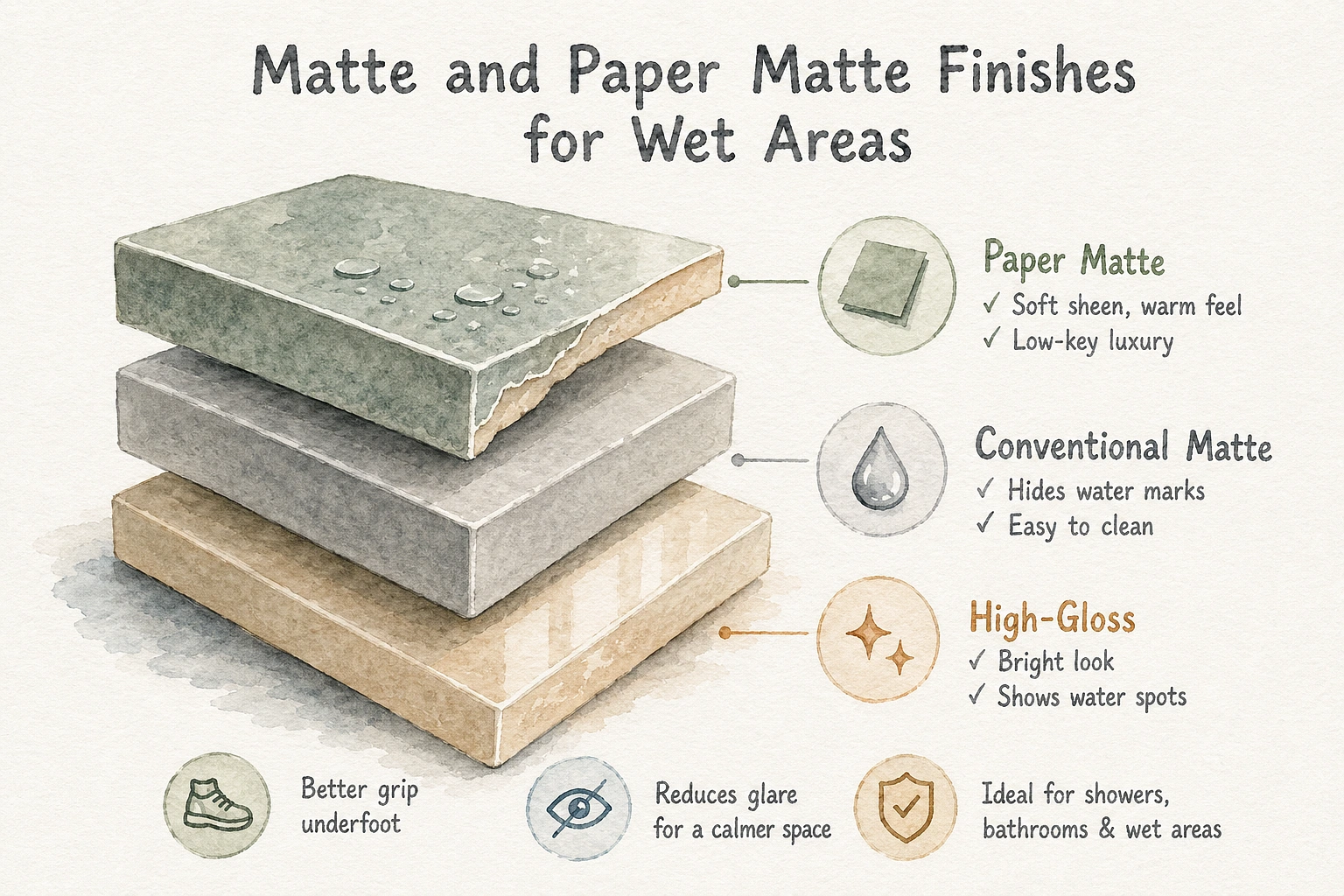
6. Matte and Paper Matte Finishes for Wet Areas
Bathroom tile finishes available on the mainstream market fall mainly into three categories: high-gloss, conventional matte, and the new paper-feel matte. Assessed along two dimensions—practicality for daily cleaning and the visual effect of spatial design—each type has distinct advantages, disadvantages, and suitable application scenarios. High-gloss tiles can capture studio lighting in professional film and television shooting scenarios to create a bright, expansive visual effect. Yet when installed in home bathrooms
with shower facilities, their wall surfaces will show every water stain, soap scum, toothpaste smudge, and fingerprint near switches. Users either have to wipe the tiles frequently, or accept that the walls will look dirty merely 12 hours after being cleaned. Conventional matte finishes, which lack a reflective coating, fully resolve this pain point. Water stains and soap scum are
nearly invisible on these tiles; they only need to be cleaned with a damp cloth and a neutral-pH cleaner, and the walls can maintain a clean appearance between every two cleaning sessions. The new paper-feel matte finish sits between standard matte and satin finishes. Its tactile quality resembles that of thick cardstock, with an extremely faint sheen. It feels warmer than completely flat matte tiles without being overly reflective, boasting a low-key, high-end texture. It is mostly used in high-end hotel bathrooms and residential projects that pursue an understated sense of luxury.
The practical advantage in wet areas specifically is that matte and paper matte surfaces also provide marginally better grip underfoot if used on shower floors, and they reduce glare from bathroom lighting which makes the space feel calmer, especially first thing in the morning when you don’t want every surface bouncing light into your eyes.
All bathroom wall finishes are functionally viable, but to select a style suited to your home, you must first clarify four core conditions: the amount of natural light in the bathroom, the hardness of your household water, the frequency of cleaning you can consistently maintain, and whether you intend for tiles to serve as the visual focal point or a background element. Sorting out these details before browsing any product catalog will help you avoid the common pitfall of choosing an option that looks appealing in online images but is impractical for real-world use.