

Home & Decor Blogs: DIY, Interior Design & Lifestyle Ideas
5 Interior Design Ideas Inspired by Luxury Miami Beach Resorts
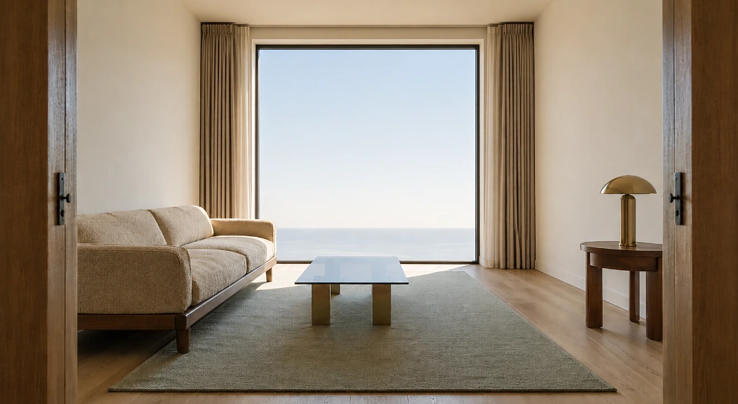
One wood, one metal, one palette, repeated everywhere. Almost everything else on your mood board is optional
Most people copy a hotel room by buying something from it. That is the whole problem right there!
You see a suite you love, you screenshot it, and six weeks later there is a rattan chair in your living room doing nothing for anybody. The chair was never the reason the room worked.
So, guest rooms and suites only in this post. Not resort lobbies, not pool decks, not restaurant interiors, because those are designed for a hundred strangers a night and your living room is designed for four people and a dog.
Now the bit I actually care about. Resort designers work to a written material list and a fixed palette, and they do not deviate from it once it is set. Ask most homeowners what their material list is and you get a blank look, and that difference explains almost everything about why one room feels finished and the other one feels accumulated.
At a Glance
Match the idea to the room you are actually annoyed with. Then use the last column to work out what it will cost you before you start moving furniture.
| Idea | What it fixes | Where it comes from | Effort | Real cost |
|---|---|---|---|---|
| Clear the sightline | Rooms that feel closed in | Private balconies in every room | An afternoon | Free |
| One wood, one metal | Rooms that look busy without being full | Walnut, zebra wood, champagne bronze, smoked glass | Ongoing discipline | Free to start |
| Space around furniture | Rooms that feel cramped at any size | Oversized floor plans | An afternoon | Free |
| Materials over accessories | Bathrooms that feel like utilities | Marble counters and floors | A weekend to a week | $8 to $25 per sq ft tiled |
| Texture layering | Bedrooms that never look finished | Chenille velvet, satin, bouclé | A season of buying | Varies |
Everything in that third column is real and published. Acqualina up on Collins Avenue lists its own material vocabulary on the site, and it is worth reading before you spend anything.
1. Clear the Sightline to the Window
Every room in those luxury suites in Miami has a private balcony, and the furniture is placed so the water is the first thing your eye finds when you walk in. That is the actual design decision. The ocean is doing the work, and everything in the room steps aside to let it.
You do not have an ocean. You do have a window, and there is a decent chance something is parked in front of it.
Stand in your doorway and notice where your eye lands first. If the answer is the back of a bookcase or the arm of a sofa that is too big for the room, you have found the job for this weekend, and it costs nothing but a sore back.
Curtains, and the mistake almost everyone makes
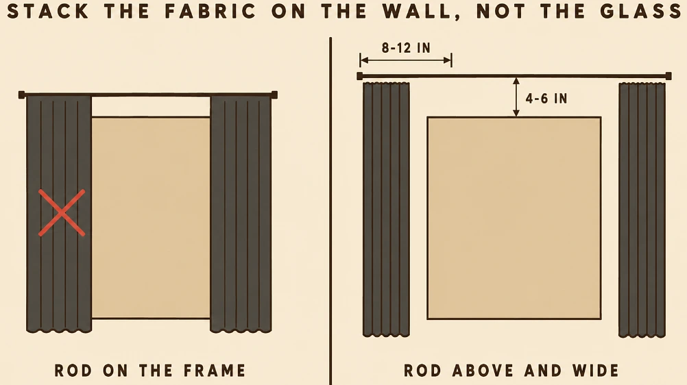
Hang the rod 4 to 6 inches above the window frame, not on it, and run it 8 to 12 inches wider than the opening on each side. That way the fabric stacks against the wall when it is open instead of covering the glass.
Sheers by day, something heavier for the evening. Two layers on one rod is the hotel version and it is not expensive.
On colour, warm whites, sand, soft taupe and pale blue will do the coastal thing without anybody having to mention the coast. Acqualina describes its own palette as sun bleached, so grey, taupe, sand and celadon. Notice what is not in that list. No navy, no turquoise, no rope, no shells.
2. Pick One Wood and One Metal, Then Repeat Them Everywhere
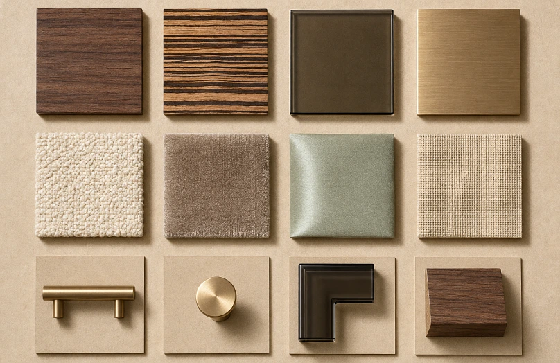
Here is the discipline behind that resort look, and it is genuinely the cheapest idea on this page because it is a rule rather than a purchase.
The Acqualina rooms run on walnut and zebra wood, champagne bronze, and smoked glass. Four finishes. That is the entire vocabulary, used across headboards, tables, hardware and lighting, and nothing else was allowed in.
Now count the finishes in your living room. Oak table, chrome floor lamp, black metal shelving, brushed nickel door handles, a brass mirror somebody gave you. Five or six, each fine on its own, all bought at different times without a rule sitting over them.
Choose one dominant wood and one metal. Write them down somewhere. Anything new either matches or it does not come into the house.
Warm metals read softer than cool ones, which is why hotels lean on champagne bronze and brushed brass rather than chrome. And smoked or tinted glass is the piece people never think of, because a smoked glass coffee table looks lighter in a room than a solid one and reads far more expensive than it costs.
3. Leave Space Around the Furniture
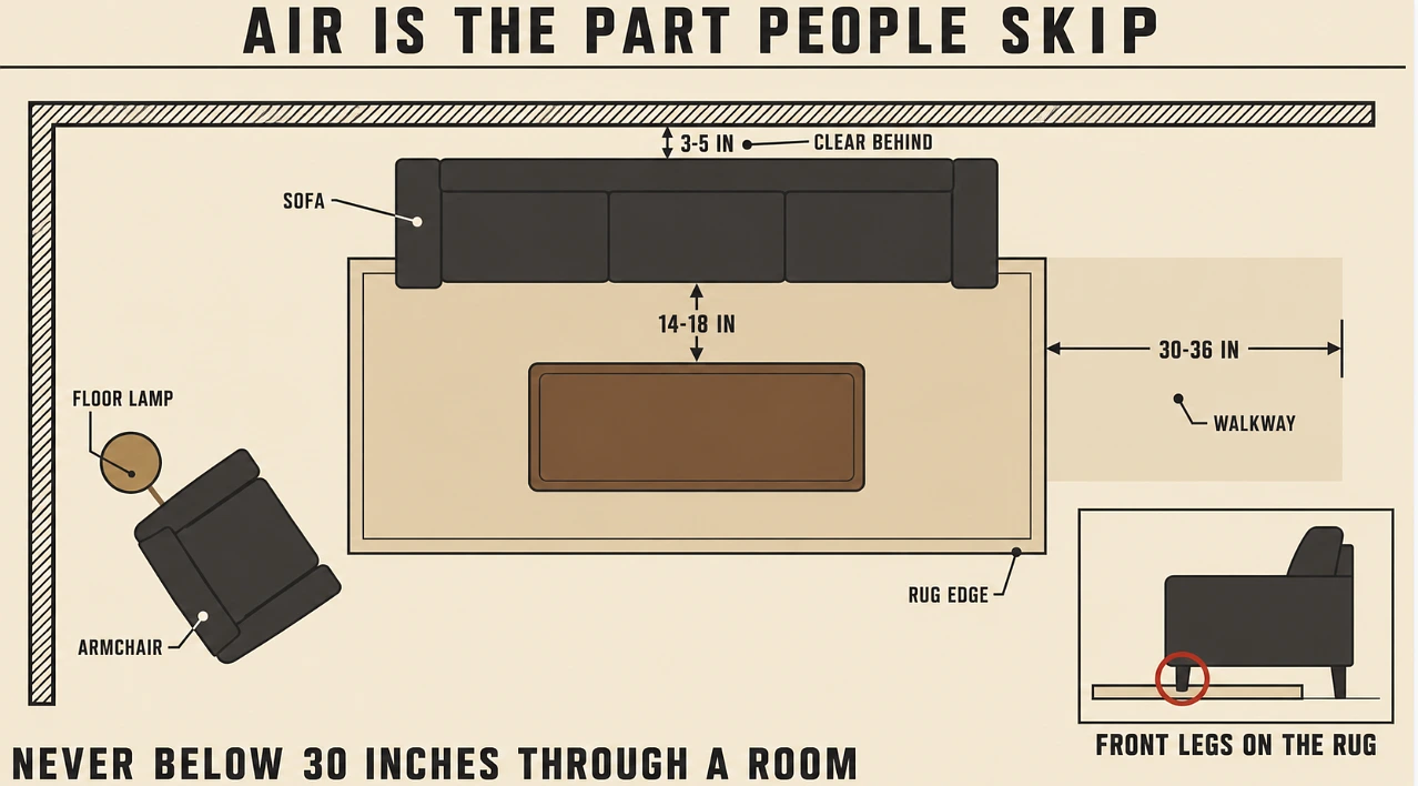
Suites feel generous partly because of the square footage and partly because the designer stopped adding things. Fewer pieces, better proportions, air between them.
You can check your own room against the working numbers tonight with a tape measure.
- 30 to 36 inches of clear walkway through a room, and never below 30.
- 14 to 18 inches between the sofa and the coffee table, which is close enough to set a drink down without leaning.
- 3 to 5 inches between the back of the sofa and the wall, because furniture shoved flat against the plaster makes a room look smaller rather than larger.
- Front legs of the sofa on the rug, not floating behind it, which is the single most common rug mistake in a living room.
Would your room pass that? Most fail on the walkway, and almost always because of one piece too many rather than a room that is too small.
4. Do the Bathroom With Materials and Light
Resort bathrooms spend the money on surfaces and lighting and then stop. Acqualina uses Veno Oro marble counters, marble floors and Molteni vanities, which is not a realistic budget for most houses, though the principle underneath it costs a lot less than the marble does.
Fewer grout lines is most of what makes a bathroom feel calm. That is the whole secret, and large format porcelain gets you there.
A 24 by 48 inch stone look porcelain does the job. Budget $8 to $15 per square foot installed for a standard layout, and $15 to $25 once you are into genuinely large format with proper substrate prep, because large tiles need a flat floor and flattening a floor is where the labour goes.
The lighting, which is what people get wrong
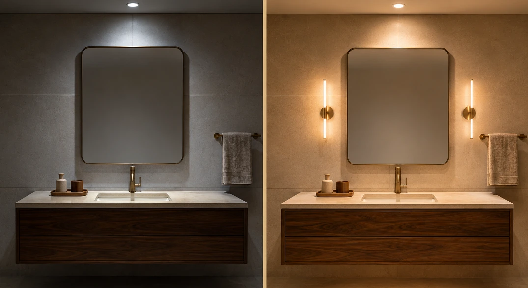
One ceiling fixture flattens a bathroom and does unkind things to a face at seven in the morning. Layer it instead, so general light overhead and something at eye level next to the mirror rather than above it.
Bulbs at 2700K to 3000K, and look for CRI 90 or higher so skin tones read properly. Cooler than that and the room goes clinical, and no amount of stone fixes a clinical bathroom.
Then clear the counter. One tray, everything else in a drawer, which costs nothing and does more than the tile.
5. Layer Textures Instead of Patterns in the Bedroom
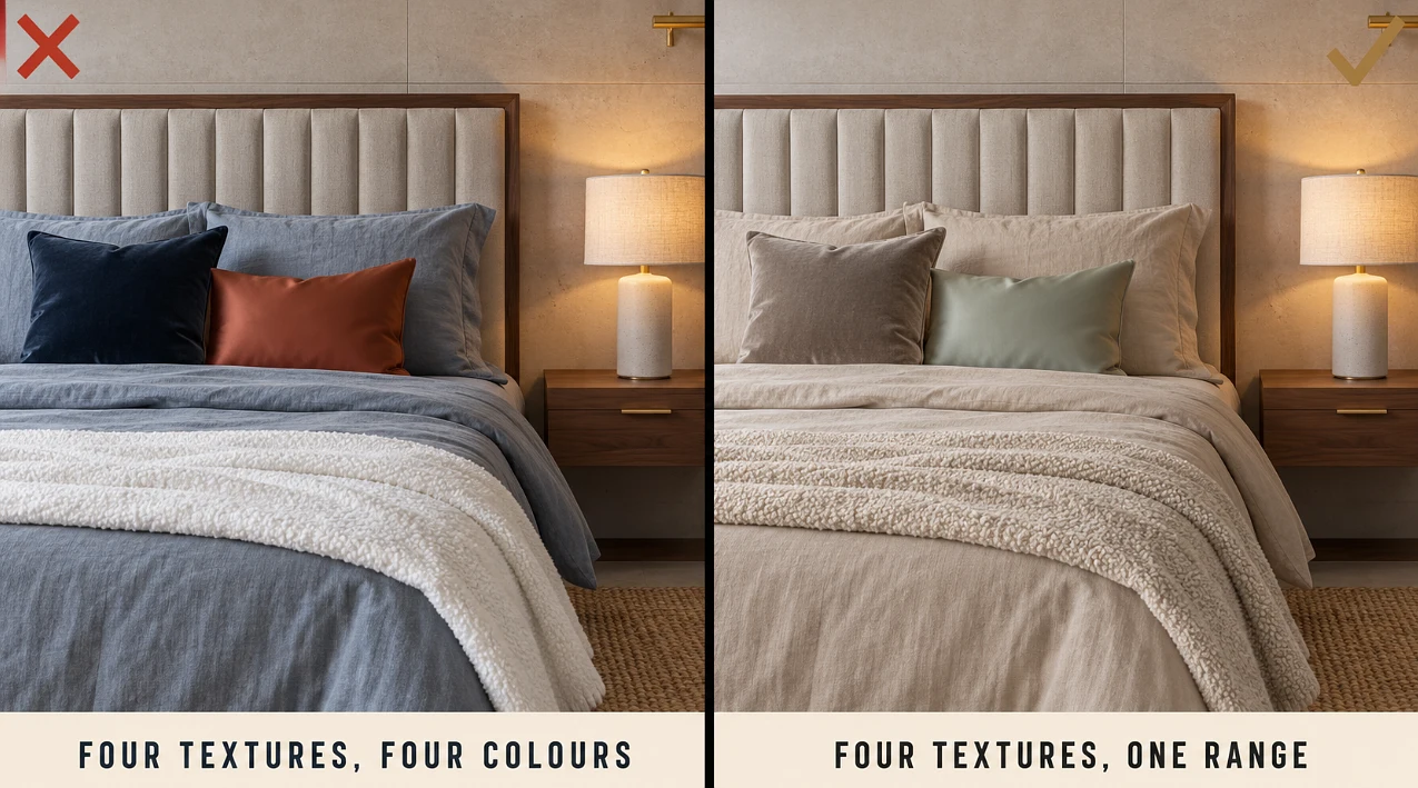
The material list at Acqualina for soft surfaces is chenille velvet, plush satin, bouclé and woven textiles, with channel tufted walnut wrapped around the headboards, all of it inside that same narrow sun bleached palette.
Read that again and notice the structure. Four or five textures, one colour range. The interest is in how things feel, not in anything competing for attention.
At home that means linen bedding, an upholstered headboard, a wool or jute rug, timber nightstands, and lamps rather than the ceiling light. Three or four textures is plenty, and keeping them tonally close is what separates layered from busy.
Curtains matter here more than people expect too. A bedroom with bare windows never looks finished, whatever you spent on the bed.
What the Resort Look Actually Costs
Everybody assumes this is a money problem. Some of it is. Most of it is not.
Three of the five ideas on this page cost nothing at all. Clearing the sightline, spacing the furniture properly and taking the clutter off the bathroom counter are all afternoon jobs with a zero on the invoice.
Then the small money. Curtains and a rod done properly, warmer bulbs with a decent CRI, a smoked glass side table. That tier changes a room noticeably and it is the tier most people skip because it feels too simple to matter.
The real spend is the bathroom tile and the upholstered headboard, and both of those can wait a year without anything looking wrong in the meantime.
Where I Would Start
Palette first, before you buy anything, because every later decision gets easier once the range is fixed.
Material rule second, one wood and one metal written down.
Then the free jobs, sightlines and spacing. Then curtains and bulbs. Then, only then, the tile and the headboard.
That order matters because the expensive things are the ones most people do first, and they are the ones that fix the least. A five star suite is mostly restraint and repetition wearing marble, and restraint has never had a price tag on it.

 Decor & Improvement Accessories