

Home & Decor Blogs: DIY, Interior Design & Lifestyle Ideas
Why Most Commercial Interior Product Mistakes Happen Before Anyone Touches a Sample

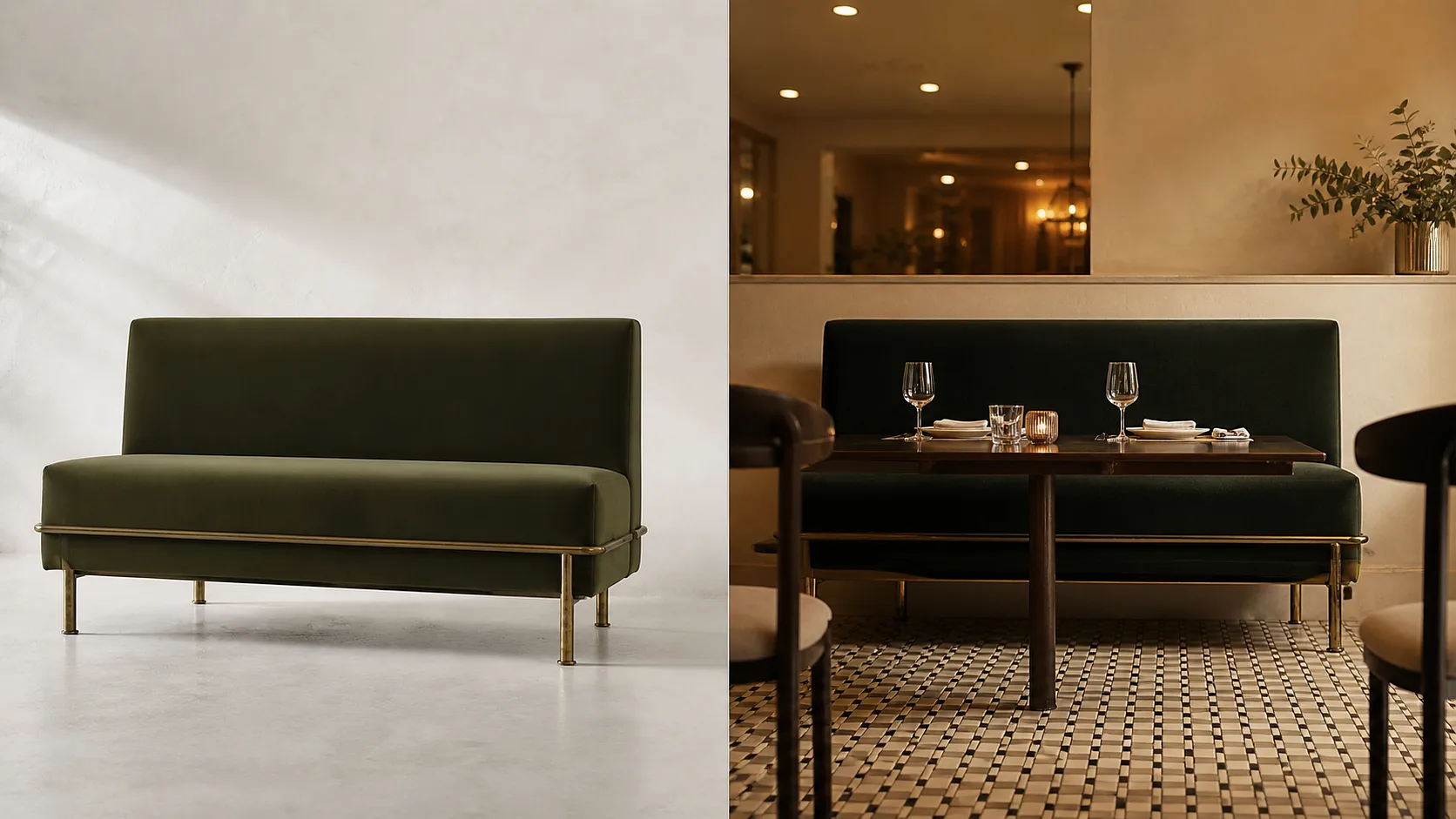
A hospitality group signs off on a banquette design based on a manufacturer’s lookbook photo. The photo was shot in a Scandinavian studio with 4-metre ceilings and diffused northern light. The actual restaurant has 2.8-metre ceilings and warm downlights at 3000K. The banquette arrives, gets installed, and reads completely different — heavier, darker, somehow cheaper-looking despite costing $1,200 a metre. Nothing was wrong with the product. Everything was wrong with how it was evaluated.
That gap — between how a product looks in isolation and how it performs in the specific space it’s going into — is where most commercial interior design mistakes originate. Not at installation. Earlier. During the selection process itself.
The Problem With Evaluating Products Outside Their Intended Context
Residential designers can get away with a showroom visit and a few fabric swatches. The variables are manageable — one family, one light condition, one set of preferences.
Commercial doesn’t work that way. A hotel lobby chair needs to read correctly from the entrance at 20 metres, from the reception desk at 5 metres, and from the adjacent seat at arm’s length. Simultaneously. A retail fixture has to hold product without visually competing with it. A restaurant booth has to look inviting from the host stand while actually being comfortable for 90 minutes once you’re sitting in it.
These are spatial and lighting relationships that can’t be assessed from a product photo shot against a white backdrop. And they definitely can’t be assessed from a technical drawing with dimensions marked in millimetres — which is still how a surprising number of product approvals happen in commercial practice.
The result is predictable. Products get specified on the basis of how they looked somewhere else. They arrive on site looking like something the design team didn’t choose. Revision cycles start. Budgets move. Opening dates shift. And the root cause wasn’t a bad product — it was an evaluation method that couldn’t show the team what they actually needed to see.
What Actually Needs to Be Tested Before Specification
- Scale relationships that only exist in the real space. Depending on what table the dining chair is to sit with, the pendant over it and the height of the ceiling that will frame the entire chair. A chair that is light and elegant with a ceiling of 3.5 meters will feel small and dwarfed by a 5 meter high ceiling. Same chair. Different context. Different verdict. This cannot be tested on the page of a catalogue, but must be viewed in the space relationship it will really exist in.
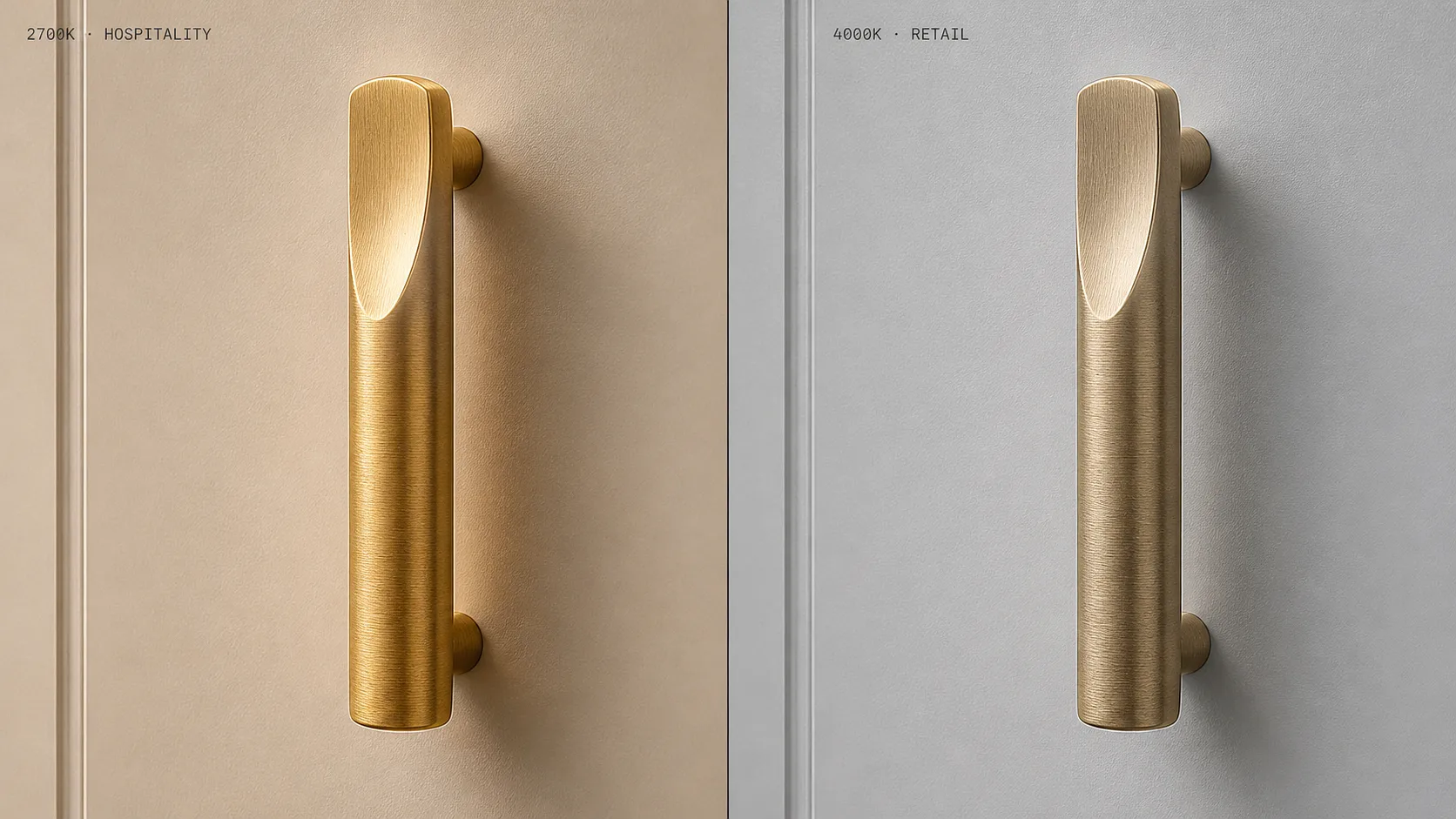
- How finishes behave under the project’s actual lighting. Brushed brass reads warm and textured under 2700K hospitality lighting. Under 4000K retail lighting, the same finish looks industrial and cold. A dark timber veneer that photographs with visible grain in natural light can flatten to a near-black panel under recessed downlights. Designers know this intellectually, but the evaluation tools most commonly used — swatches, sample boards, manufacturer photos — don’t demonstrate it in context. The finish gets approved based on how it looks under one light, then lives permanently under a different one.
- Circulation impact that floor plans can’t fully communicate. A 600mm-deep seat with a 400mm table gap looks fine on a plan drawing. In three dimensions, at a table height of 750mm, it might block a service corridor or create an awkward squeeze for anyone larger than average. Accessibility compliance adds another layer — clearances that meet code on paper can still feel restrictive in practice depending on the furniture profile. These are judgment calls that benefit from volumetric evaluation, not just plan-view measurement.
Where Digital Product Models Close the Gap
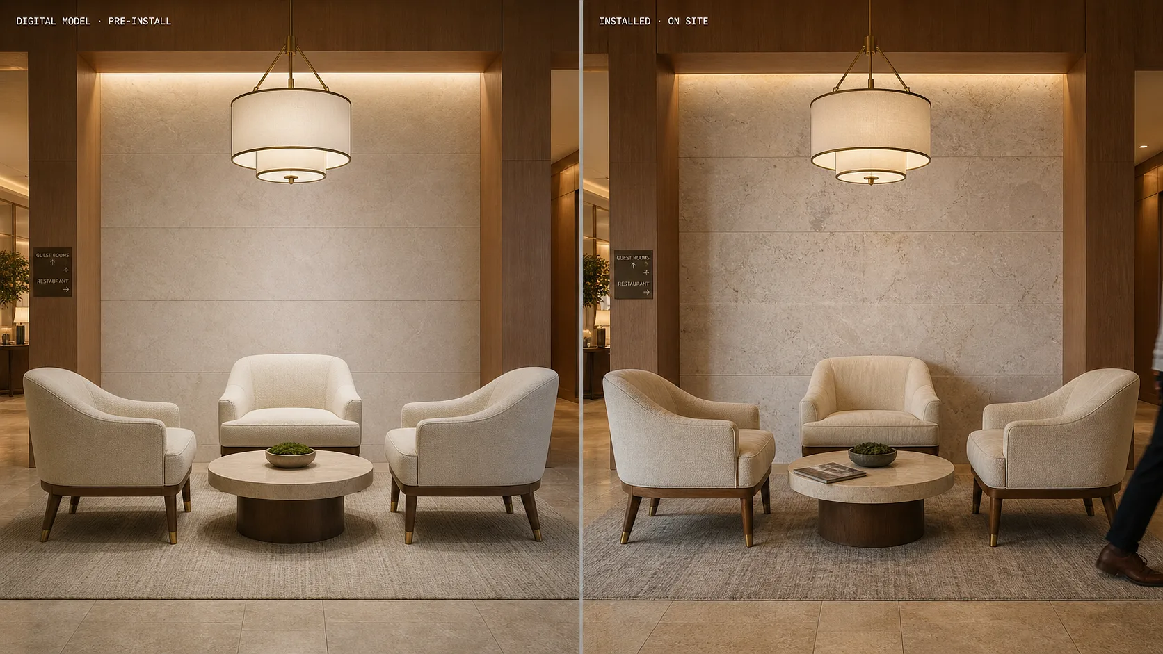
This is where the evaluation process has shifted most in the last five years. Accurate 3D models of furniture, fixtures, and finish materials — placed inside a digital version of the actual project space, at correct scale, under simulated lighting — let design teams test the relationships above before anything physical is ordered.
It’s not about replacing material samples. You still need to touch a fabric, see a timber grain in person, check how a metal finish fingerprints. What digital models solve is the context problem: is this the right product for this space, at this scale, under this light, next to these other elements?
- For restaurant and café projects, this means comparing three banquette profiles in the same rendered dining room rather than imagining each one from separate manufacturer images. The ceiling height, the lighting layout, the floor finish, the table dimensions — all held constant while the seating variable changes. That’s a comparison you can actually make a decision from.
- For retail, fixture specification is driven by merchandising logic as much as aesthetics. How a shelving unit interacts with sightlines, how a display table’s height affects the perceived value of what’s on it, how the fixture material either supports or fights the brand — these need to be evaluated together, in the plan, not separately in a showroom that looks nothing like the store.
- For finish decisions at scale, digital modelling is particularly useful when the sample is physically small but the application is large. A 100mm tile sample tells you about colour and texture. It tells you nothing about how a full wall of that tile reads from across a lobby, how the grout lines create a visual rhythm at distance, or whether the format works with the room’s proportions. Rendering a full surface application in the project environment catches problems that 100mm samples structurally cannot reveal.
For teams comparing how different platforms handle product assets and what a strong digital evaluation workflow looks like in practice, resources like best 3D model websites break down what’s available and how the quality varies across sources — which matters because a poorly modelled product asset creates exactly the false impression this process is trying to eliminate.
The Stakeholder Problem This Also Solves
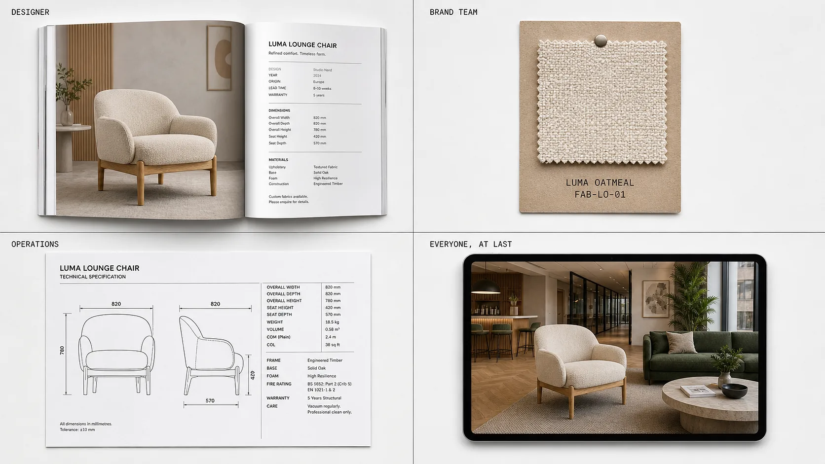
Commercial projects have more people approving product decisions than residential ones. The designer selects. The client reviews. The brand team checks alignment. Operations flags maintenance concerns. Procurement compares costs. Any of these groups can send a product decision back for revision — and frequently do.
The reason revisions spiral isn’t usually disagreement about quality. It’s that different stakeholders are evaluating the same product using different reference points. The designer sees it in context mentally. The client sees a catalogue image. The brand team sees a swatch pinned to a mood board. Operations sees a spec sheet. Nobody is looking at the same thing.
The visual reference provided by a rendered scene of the proposed products in the real space, with proper proportions, realistic lighting, and correct finishes, provides a visual reference to all the stakeholders. Conflicts nonetheless occur but they now become productive conflicts about what the design really intended and not about what a design might be like.
This doesn’t eliminate physical samples or site mockups. It reduces how many rounds of each are needed by catching the obvious mismatches digitally before samples get ordered, shipped, reviewed, rejected, and reordered. On a commercial project with 15 or 20 specified products, that compression is worth weeks.
When Does This Matter Most
Not every product decision needs a full digital evaluation. A stack chair for a conference room that’s been specified fifty times doesn’t need to be re-rendered in every new project. The established products in a practice’s specification library carry enough experiential knowledge that the designer can predict how they’ll perform.
Where digital modelling earns its time is on the decisions that carry the most risk: new products the team hasn’t specified before, custom pieces being fabricated for the first time, finishes being introduced to the practice’s palette, and any product that’s doing heavy lifting in the concept — the hero furniture, the signature fixture, the feature wall material.
These are the decisions whereby getting it wrong is costly, where the client is most apt to react against the installation and where the disparity between a manufacture photograph and the actual project landscape is greatest. The fact that the gap gets closed earlier does not ensure that the discovery of problems is moved to the point of hours spent fixing the problem rather than weeks.
 Decor & Improvement Accessories