

Home & Decor Blogs: DIY, Interior Design & Lifestyle Ideas
Simple Ways To Add Some Color To Your Home Without Regretting It Later


A neutral home is a safe home.
Nothing clashes, everything photographs well, and you never have to explain the mustard wall to a confused relative.
The downside is it can end up feeling like a rental nobody’s lived in yet. Color fixes that, and you don’t need to repaint the house or hire anyone to do it.
What you do need is a little restraint, because most color mistakes aren’t “too bold.” They’re the opposite. Someone gets nervous, picks a timid beige, and ends up with a room that reads as beige with extra steps. So here’s how I actually add color to a place, in roughly the order of how much it’ll cost you if you get it wrong.
Soft furnishings first, because they’re the cheapest mistake to make
One of the easiest ways to add colour is through cushions, throws, rugs, and curtains. These pieces can be switched out seasonally, making them ideal if you like to refresh your interiors without making permanent changes.
Seasonal swaps are the real trick here. Rust, olive, mustard in the colder months when you want the room to feel like it’s hugging you. Then soft blues and greens and a washed-out pink come spring, when all that warmth suddenly feels stuffy. You don’t need two sets of everything, just the cushion covers. The inserts stay, the covers change, and a room can feel completely different for the cost of lunch.
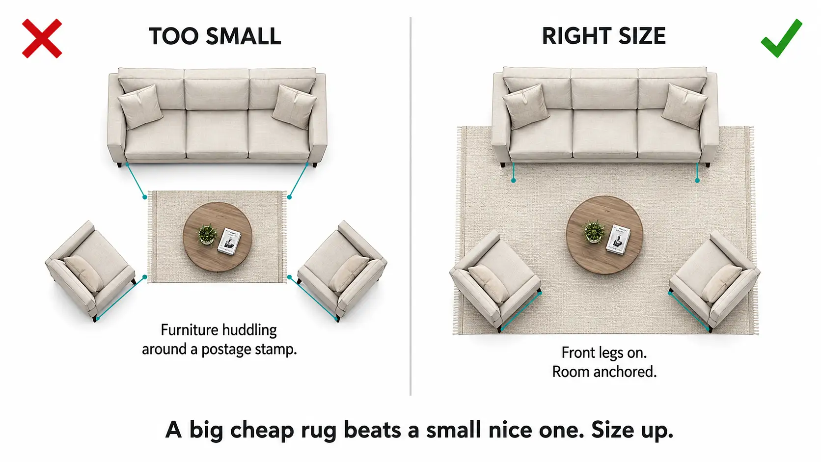
A rug will do more than all of it combined, with one warning I learned the expensive way. Buy it too small and it makes the whole room look shrunken, like furniture huddling around a postage stamp. The front legs of the sofa need to sit on it. If they don’t, size up. A big cheap rug beats a small nice one every time in a living room.
Art, and why matching it to the room is a rookie move
Artwork is a brilliant way to introduce colour, which is the bit that makes a room feel like a person lives there instead of a catalog. A big print over the sofa, a cluster of frames up a stairwell, one loud canvas in a dining room that’s otherwise quiet.
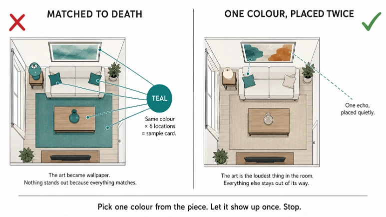
Here’s where people go wrong: they try to make the art match. They pull a teal from the painting and then there’s teal in the cushions and teal in a vase and teal in the lampshade, and the whole room turns into a sample card. Don’t. Pick one color out of the piece, maybe two, and let it show up once or twice somewhere else, quietly. The point of the art is the contrast. If it matches everything, you’ve turned the most interesting thing in the room into wallpaper.
Tiles, which are a pain and worth it
Tile is the one on this list that’s actual work. You’re committing, it’s messy, and a backsplash that looked great on the little sample board can look frantic across a whole wall. Using an AI mood board tool to pin the tile alongside your cabinet color, wall paint, and countertop helps you judge the combination before you order.
But tile earns its place because it brings in color through texture and pattern, not just a flat coat of paint, and it survives. Splashbacks, the floor of a small bathroom, a downstairs loo, an entry where wet shoes land. Patterned tile works best when everything around it shuts up: plain cabinets, neutral walls, let the tile be the loud one. Two patterns fighting in one small room and you’ll feel it every morning before coffee.
For a statement that still feels elegant, patterned tiles can be used on floors, splashbacks, or small feature areas. They work particularly well when paired with simpler cabinetry or neutral walls, as they add visual interest without overwhelming the room.
The small feature, where most people quietly chicken out
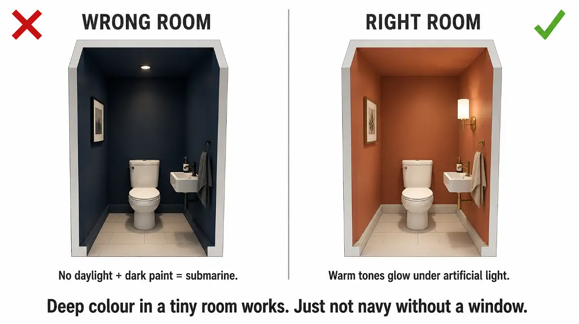
This is the move for the nervous: paint something small and contained. An alcove, a fireplace surround, the inside of a bookshelf, an internal door, the downstairs cloakroom. Small enough that a deep color you’d never dare across a whole room looks considered instead of overwhelming.
Now, the obligatory advice in every article like this is “paint your small alcove navy.” And navy does look fantastic, in the right hole. In a snug, a study, a room with some square footage and a bit of evening light, deep navy is gorgeous. Do it in a cramped windowless cloakroom and you have not created a sophisticated jewel box you’ve built a submarine. Tiny dark rooms with no daylight go from cozy to claustrophobic fast. In a space like that I’d reach for terracotta or a dusky pink instead, something warm that glows under artificial light rather than swallowing it.
One real-world thing nobody mentions: tape your baseboards properly and spend money on good tape. I once did a fireplace surround in a deep green, used the cheap blue stuff, and it bled under the edge so I spent longer fixing the baseboard line than I did painting the actual surround. Cheap tape is not a saving.
Plants, the color that’s also alive (and can also die)
Greenery brings color the easy way, and it brings movement and life that no cushion can. It also goes with everything, which is rare.
The honest catch is that “houseplant” is doing a lot of work in these articles, because the plant has to actually survive where you put it. That dark alcove you didn’t want to paint navy? A plant won’t thrive there either. Match the plant to the light or you’re just buying slow-motion compost. And lean into the pots, because that’s where you sneak color in without commitment. A row of mismatched terracotta, glazed ceramic, a bit of brass. Cheap pots, and you can change them whenever the mood shifts.
Fresh flowers and a few branches in a jug do the same job seasonally if you kill everything you own, which is a perfectly valid relationship to have with plants.
Everything else you already own
You don’t need to buy “decor” to add color. Look at what’s already in the house. Books with their jackets off, a stack of bowls, glassware that catches the light, a bowl of lemons that’s doing more for the kitchen than anything you’d order online.
Shelves, the coffee table, a sideboard, these are where you play. Group things in one color family if you want it to look deliberate and calm, or throw clashing colors together if you’d rather it feel loose and lived-in. There’s no rule. It’s a fruit bowl, not a mortgage.
That’s the whole thing, really. Start small, start cheap, and don’t smooth every color decision into oblivion trying to keep it tasteful. A home with a slightly weird color choice in it beats a perfectly inoffensive one nobody remembers walking through.
 Decor & Improvement Accessories